


Ecommerce Made Differently
Finding the balance between the complexity of a B2B solution and the sleekness of a premium fashion brand.
Product Design
Mobile First
B2B
Who's Stanley? Who's Stella?
Stanley/Stella is a Belgian company focused on sustainable, premium blank apparel for the print industry, which means they don't sell directly to the end-customer, but through a network of carefully selected Official Dealers. They wanted to redesign their webshop as their previous one didn't reflect their contemporary and innovative spirit.
My role
As a UX/UI Designer, I gathered input from multiple stakeholders to make sure the new website included all the features needed. I defined and validated user flows to guide the design of the website. I worked mostly on the Product Detail and the Product List flows, while other UX/UI colleague focused on the Check-out.
I aligned with the graphic design team (who were focused on print) to understand ST/ST's visual language. I then, translated it into a design system and component library, ensuring consistency for this and upcoming projects.
Defining the Problem
Mobile First approach
ST/ST wanted a consistent experience across desktop and mobile. The new mobile-first platform should let users complete purchases on any device.
Empowering Users
The new platform aimed to provide Official Dealers clear, real-time information so they could make informed decisions and purchase with confidence.
The Users’ habits
It was important to understand the purchase habits of the users, which differ from B2C ones.
They make regular, high-volume purchases to keep enough stock in their shops.
A single purchase often includes multiple sizes of the same style.
Demand varies by size: XS is usually bought in smaller quantities than Medium.
Users aim to reach the free-delivery threshold by buying in larger quantities.
Users’ locations determine which warehouse the system assigns to them.
A select group of users has access to extra features, such as credit lines or backordering.
User Needs and Pain Points
I started working with some initial user-stories provided by the Product Owner, that helped me understand the users' most urgent pain points. They were not linked yet to a complete flow or journey.
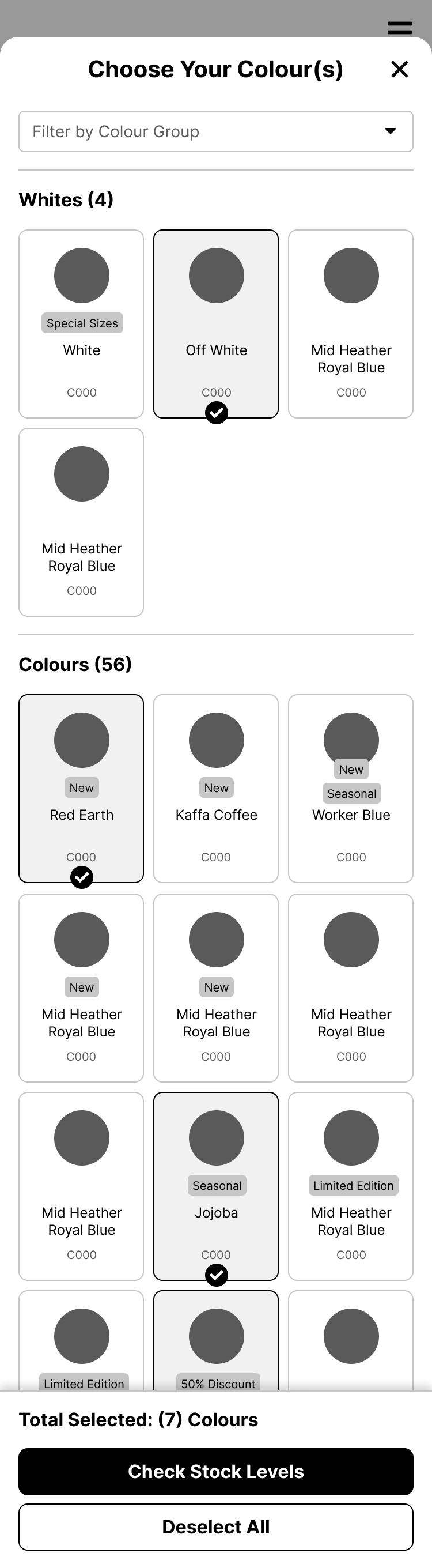
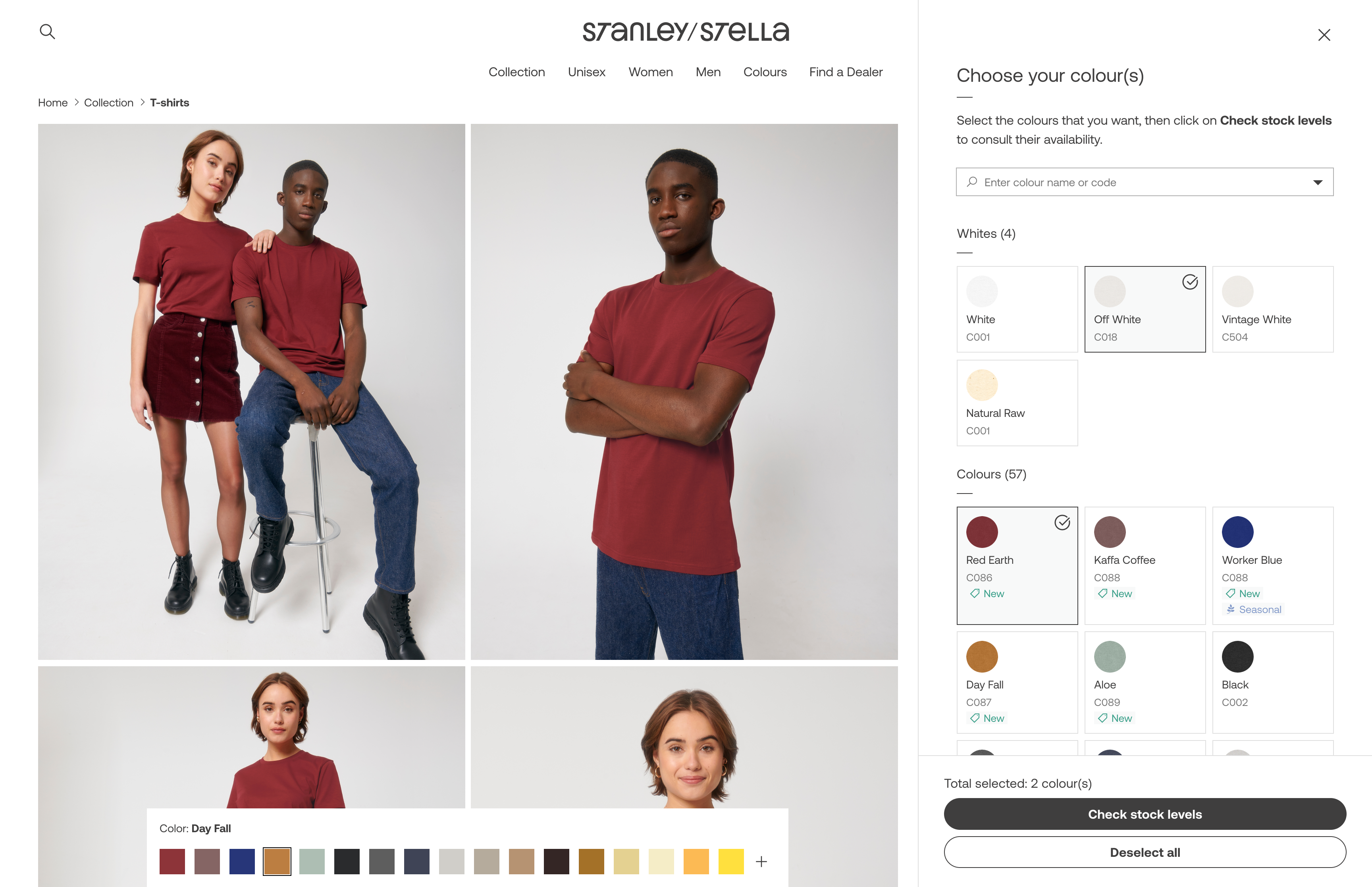
As a user, I want to know all the colours that exist for a specific style so that I can find the one that most suits my expectations.
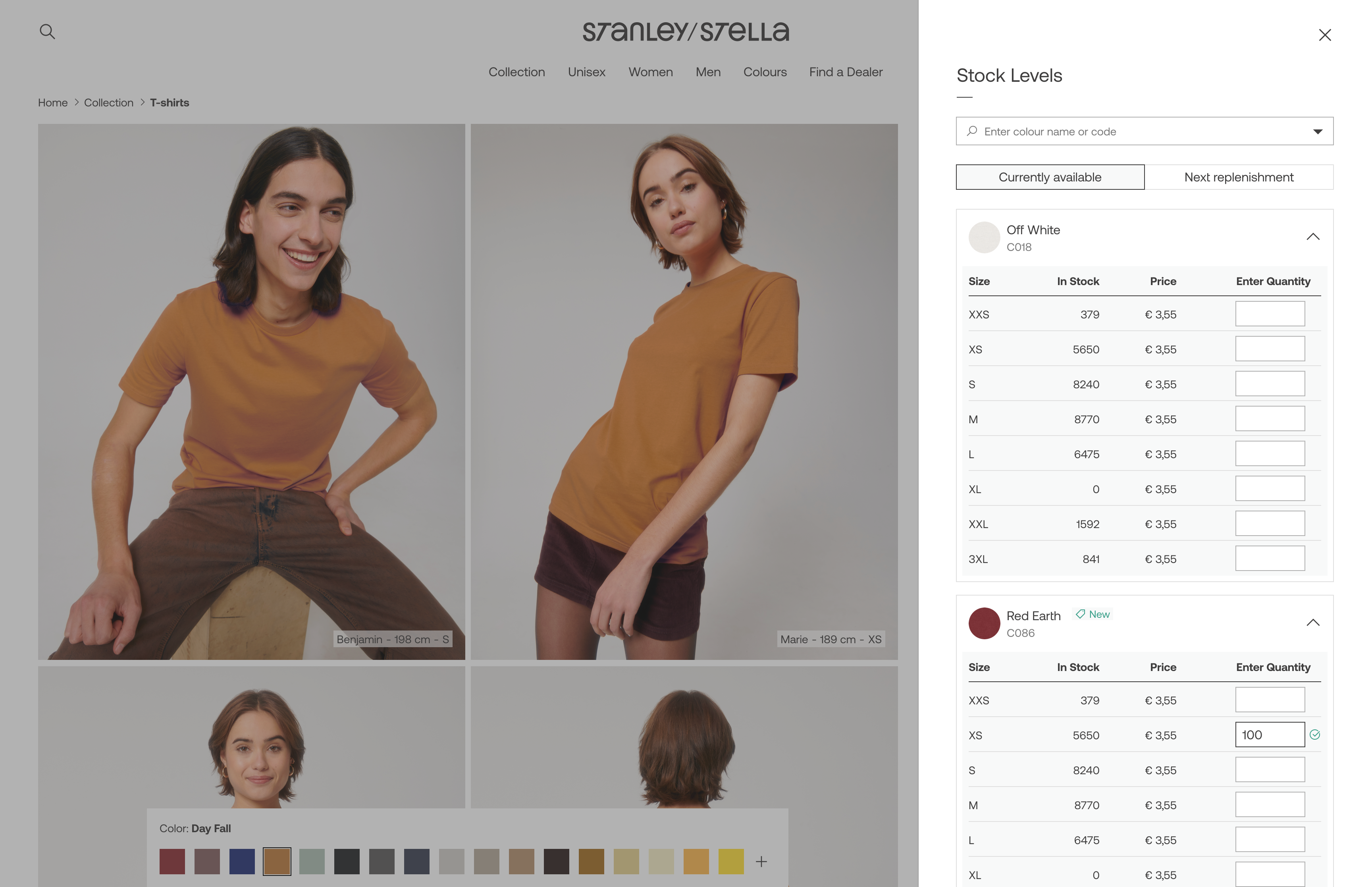
As a user, I want to see the full local stock per size so that I can order my quantity accordingly.
As a user, I want to activate an alert for back in stock so that I can order when available.
As a user, I want to directly see the size range (XXS-5XL) of a style so that I know in which sizes the style is available.
As a ‘Tier A’ customer, I want to see the expected inbounds so I can plan my purchases accordingly.
I created initial users flows and discussed them with the Merchandising, Logistics and Development teams. This had two purposes: understand what buyers could do and not do and ensure that proposed solutions where feasible both technically and logistically.
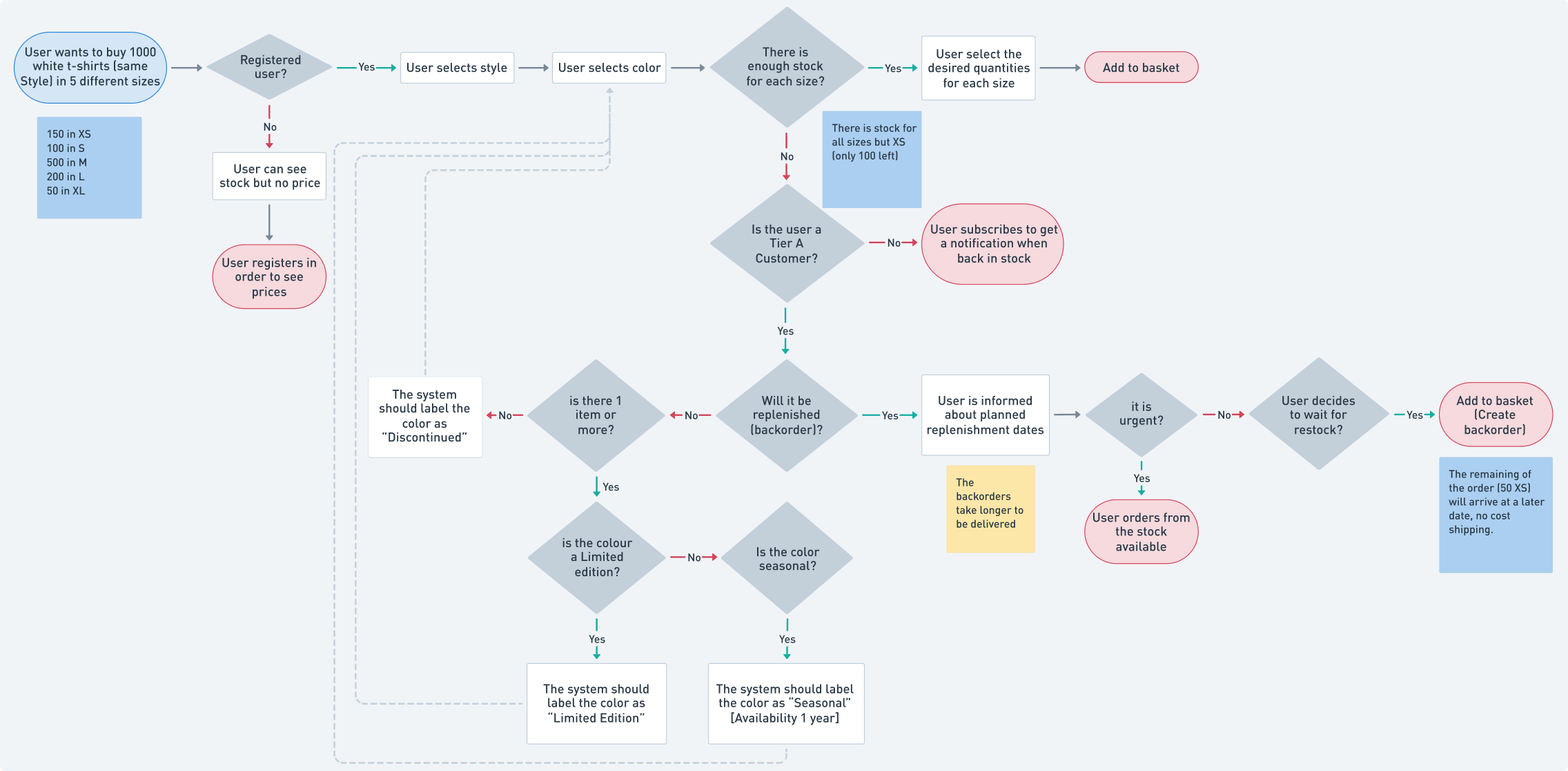
Sample of how a user assigned to the local warehouse would complete a purchase. View in Whimsical.
Wireframes
The purchase flow: Happy path
This is the more straightforward path. It happens when users select models, sizes and colors that are available. Users can:
- See products’ description, pictures, size range, etc.
- Select one or more products in multiple sizes and colors.
- See availability of the selected items.
- Add order to basket.
Logged User
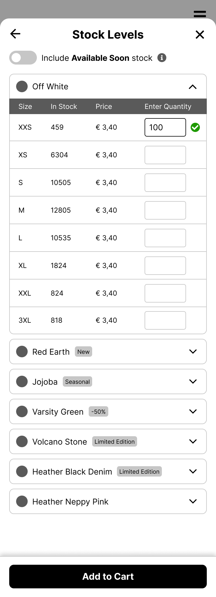
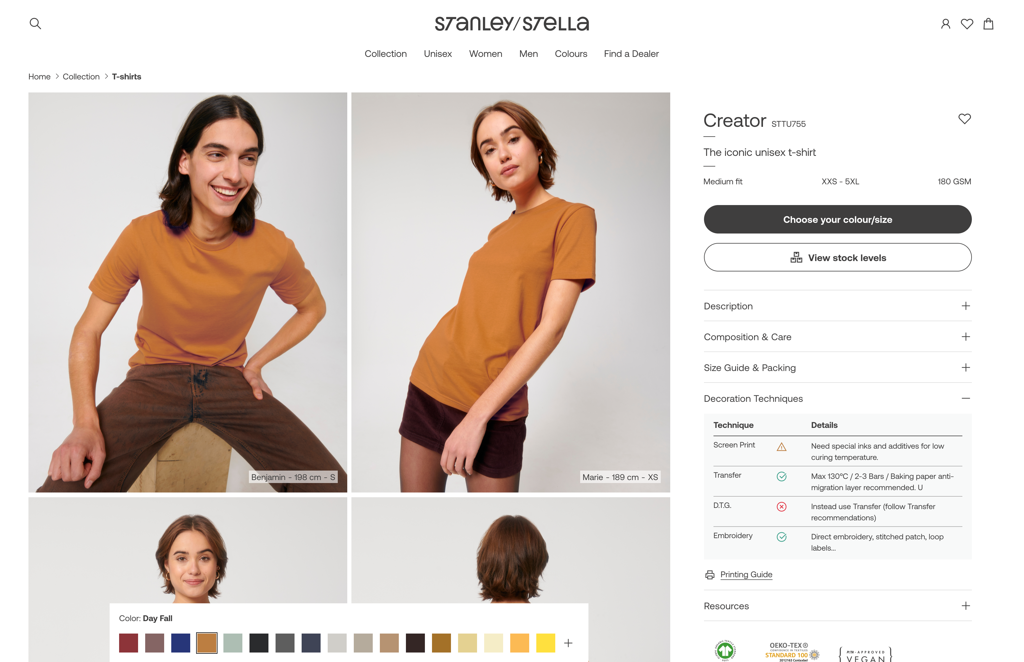
The purchase flow starts in the Product Detail page, by clicking the "Choose your Color/Size” CTA.
When the user stars selecting colors, a menu will appear with: CTA for continue and CTA for unselect. That menu will be fixed on bottom.
When the user adds a quantity, the menu “Add to cart” will appear. The quantity will be validated. If available, a check icon will appear.
The purchase flow: Backorders
This is a specially complex path. When the available stock is not enough to complete the users’ orders, they can:
- See current and upcoming stock (if any), to make a more informed decision
- Make a backorder, in other words, receive the product in 2 or more batches as they become available.
- Activate an alert to be notified when a product is back in stock.
Tier A Customer
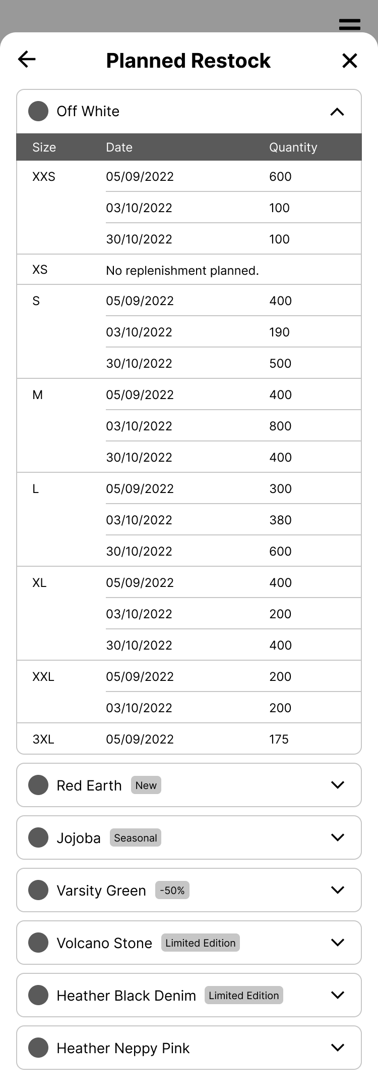
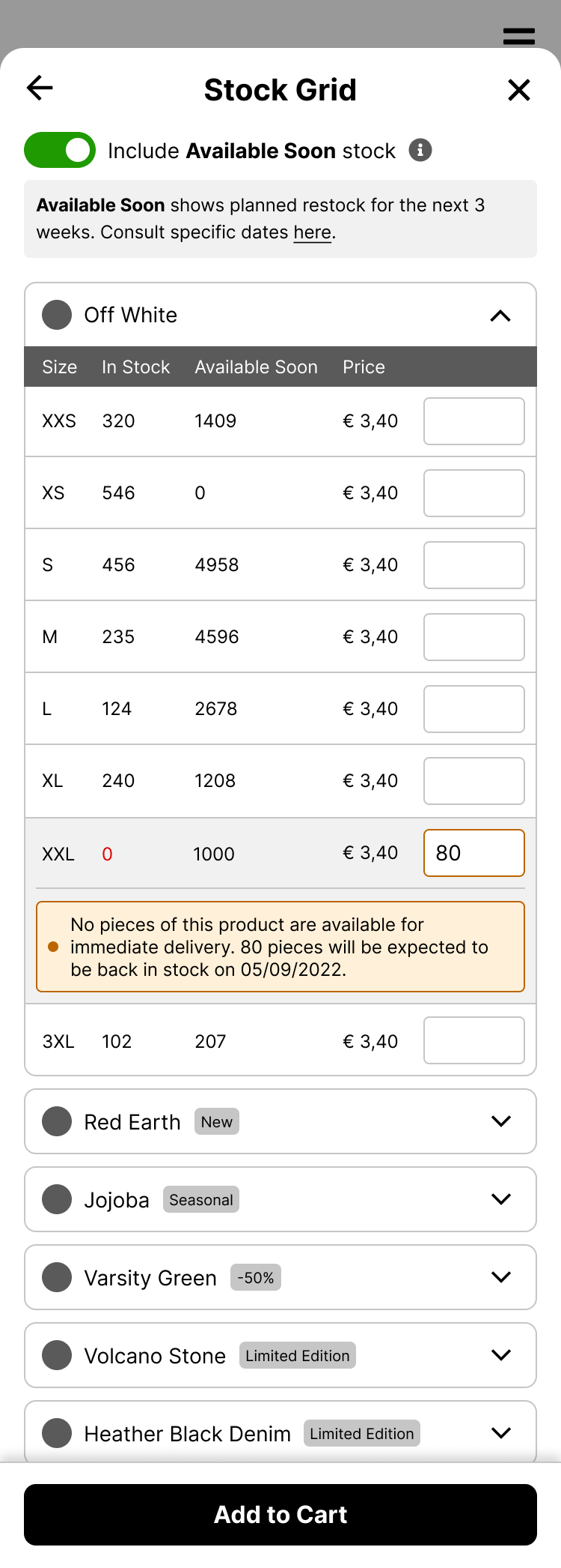
The “Available Soon” toggles on/off a column with the inbounds planned for the next 3 weeks.
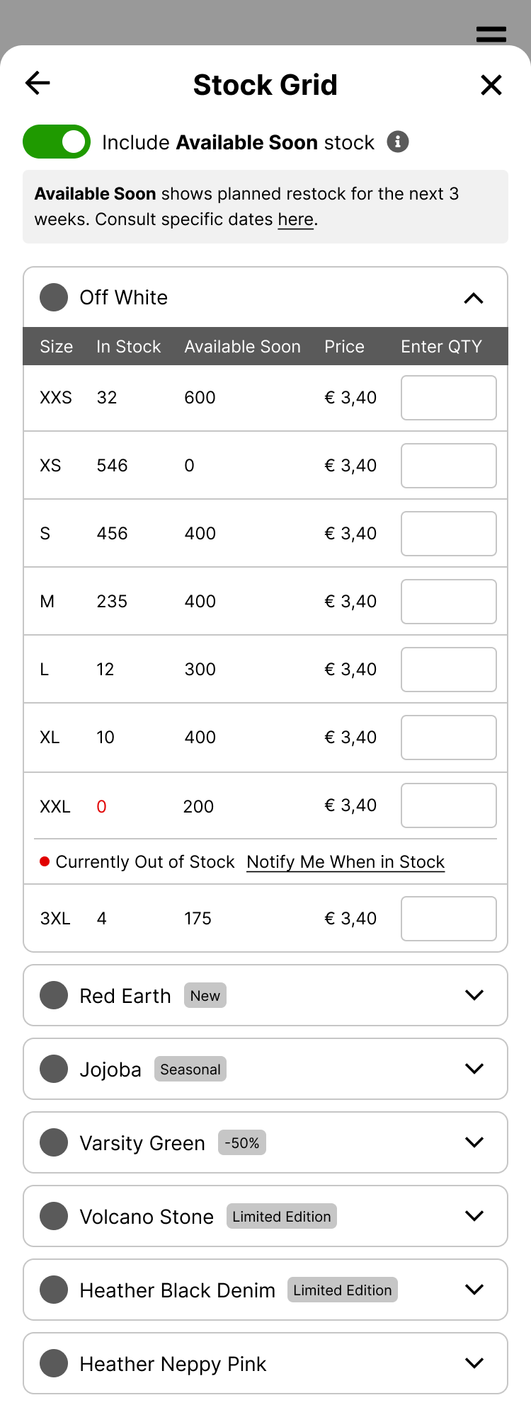
User can see more detail about exact dates in “planned restock” (Available soon: see more)
If the user enters a number higher than the current stock, it will be informed of a potential backorder.
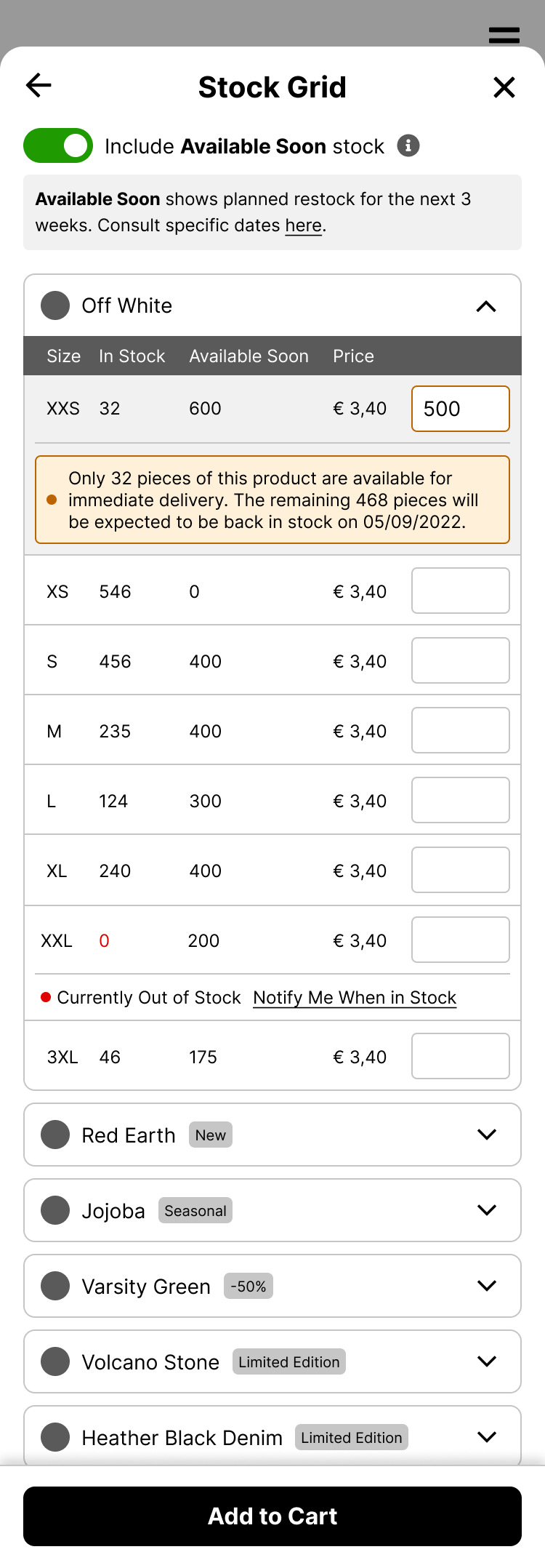
If the stock is 0 and the user enters a number, the system will inform them of a potential backorder.
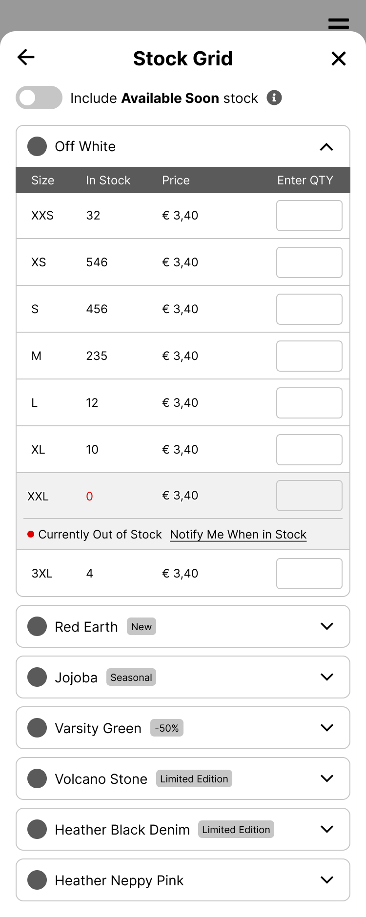
Out of Stock
Not all users are enabled to create backorders. They can get notified when the product is back in stock.
Order Soon
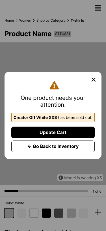
Scenario: Product ran out of stock after the quantity was checked, but before it was sent to cart.
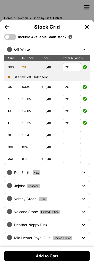
After trying to add to cart, an error message will appear. It will also provide the option to go back.
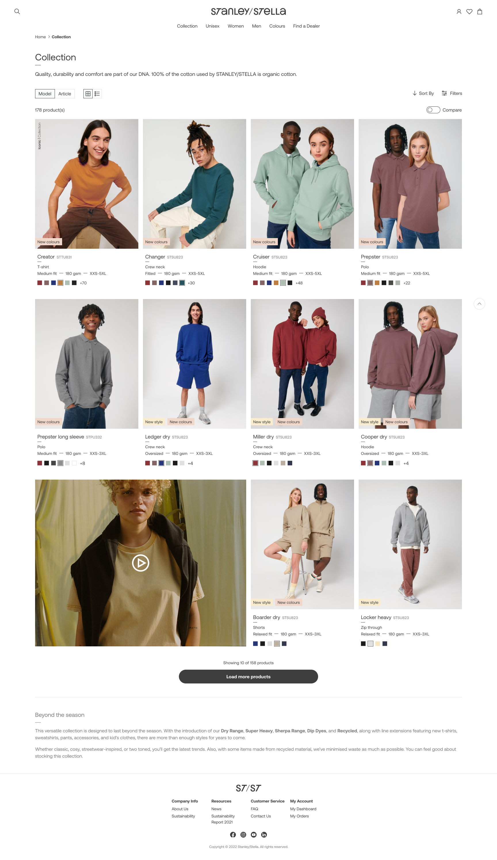
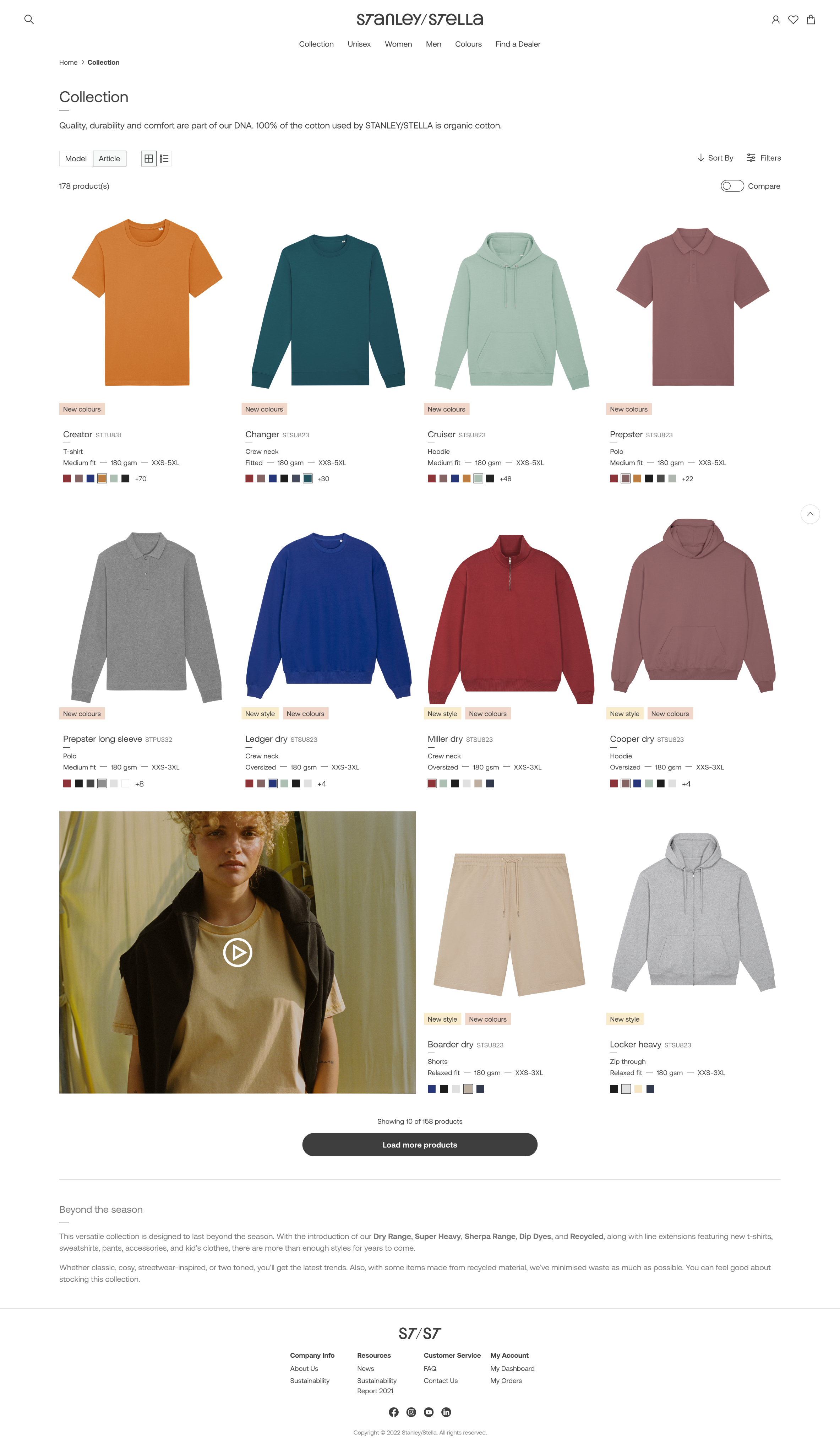
The Final Designs
Desktop
After the wireframes were validated, I moved on to the final designs. I spent time benchmarking other fashion e-commerce sites to understand current visual trends and best practices.
The flows and features stayed the same, but I refined the layouts and patterns, especially for desktop.
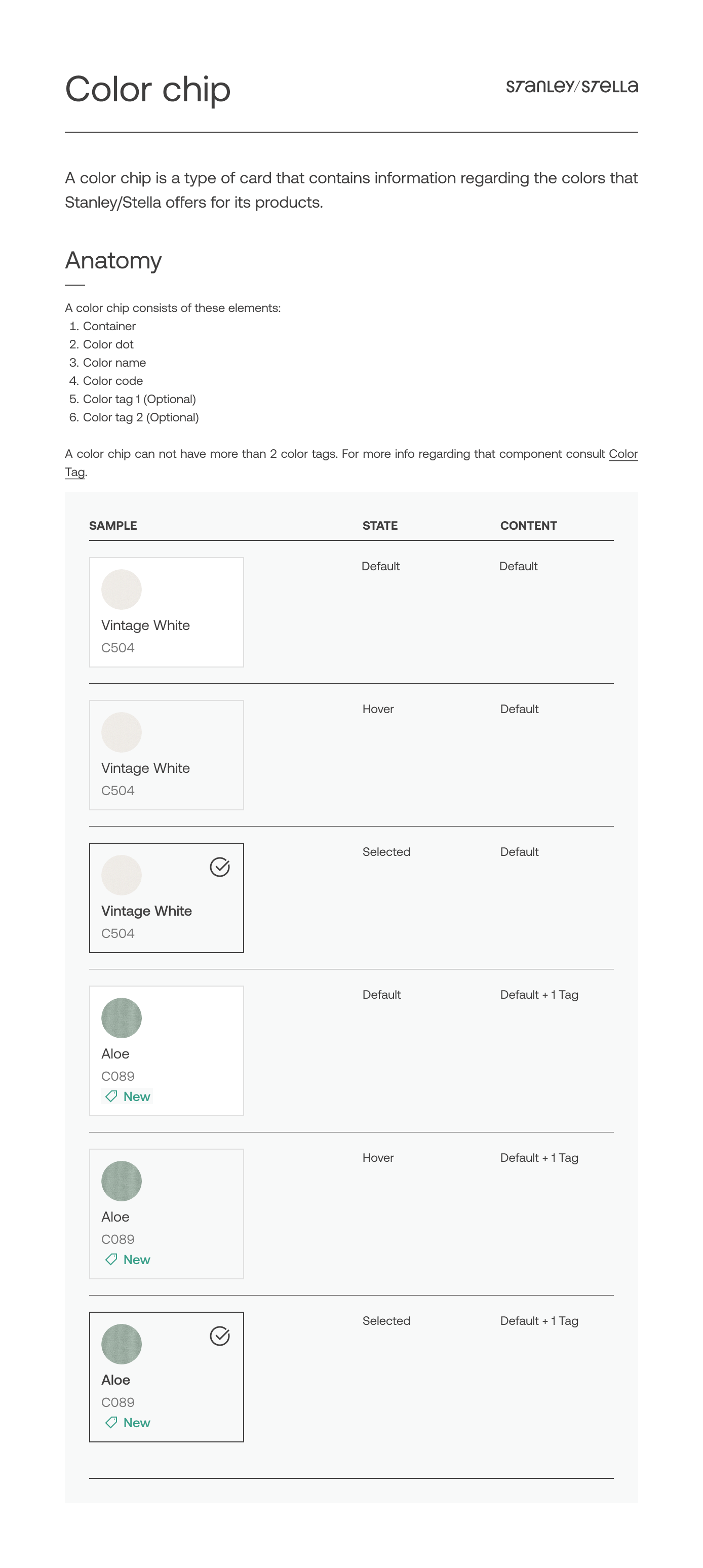
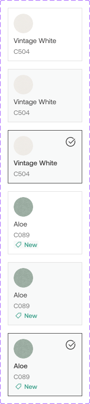
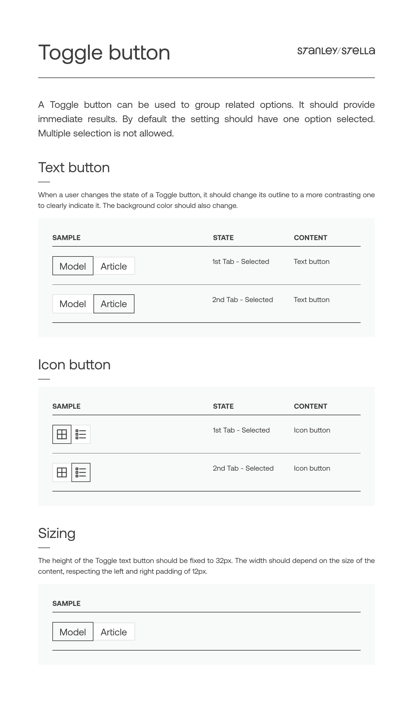
Component Library
The component library in Figma was built and documented alongside the design work. Once a screen was approved by all stakeholders, I documented its components and variants to keep everything consistent and easy to update.
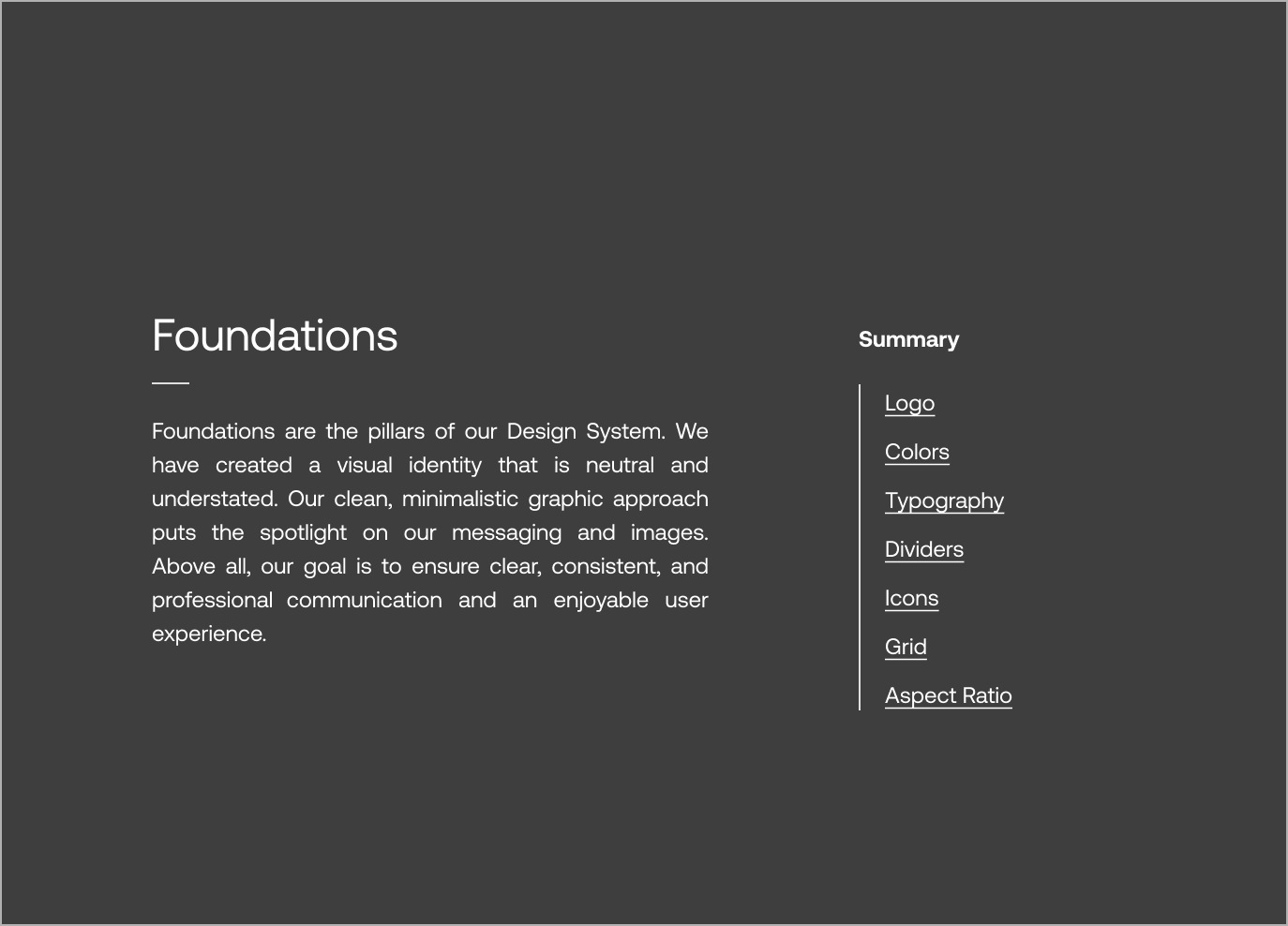
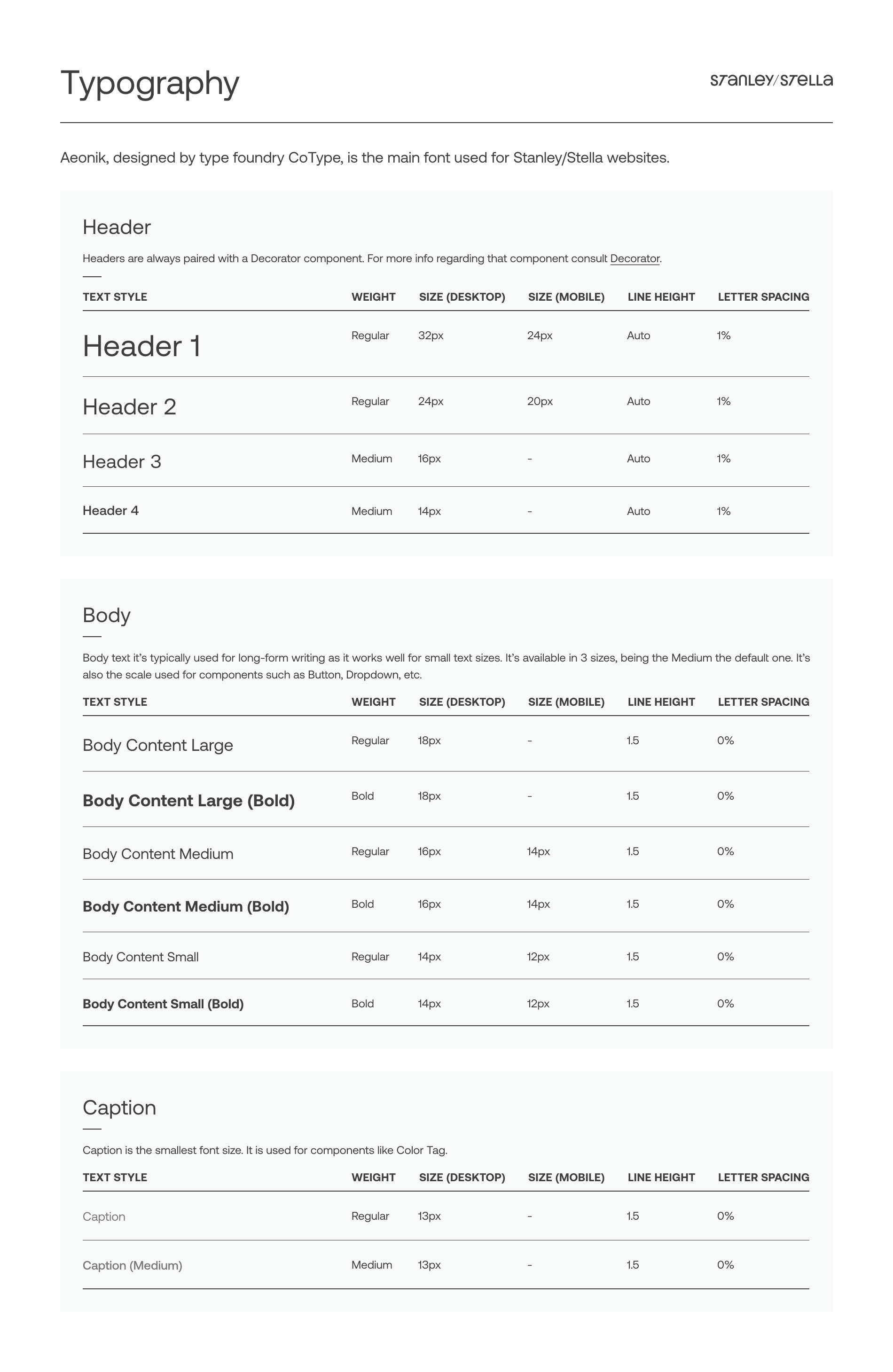
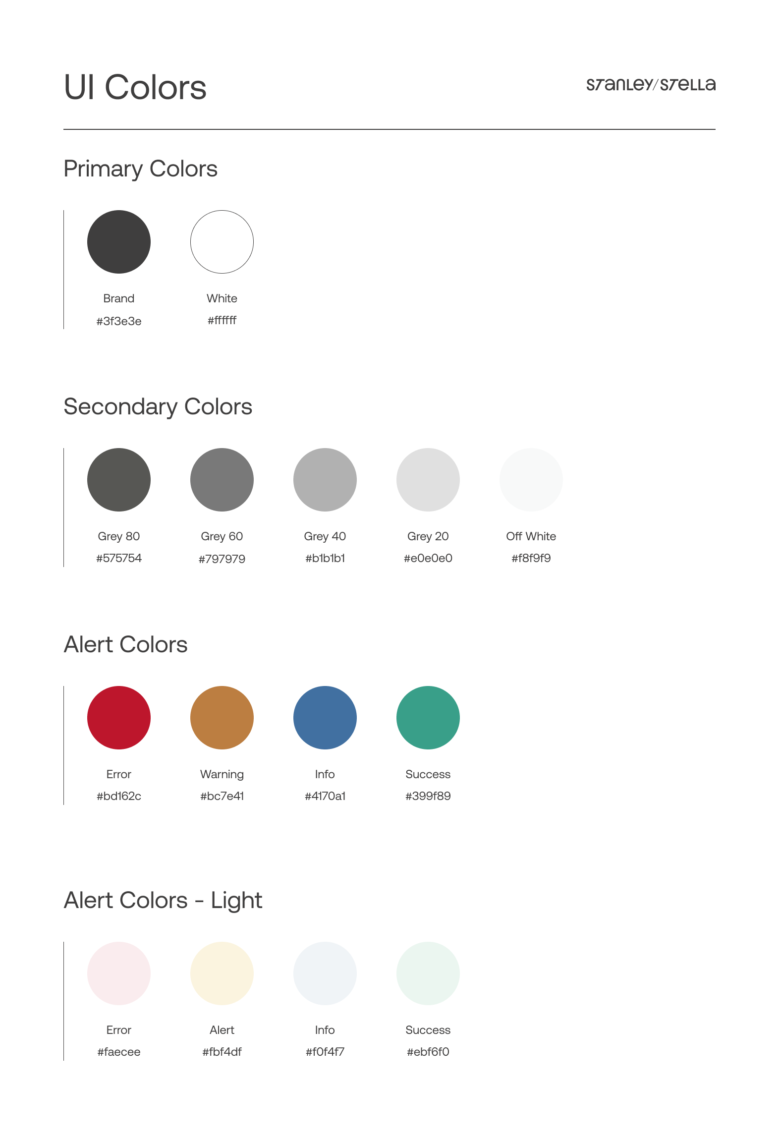
Foundations
This section covered the building blocks of the design system (colors, typography, grid, icons, etc.) that shaped all the components and screens to follow.

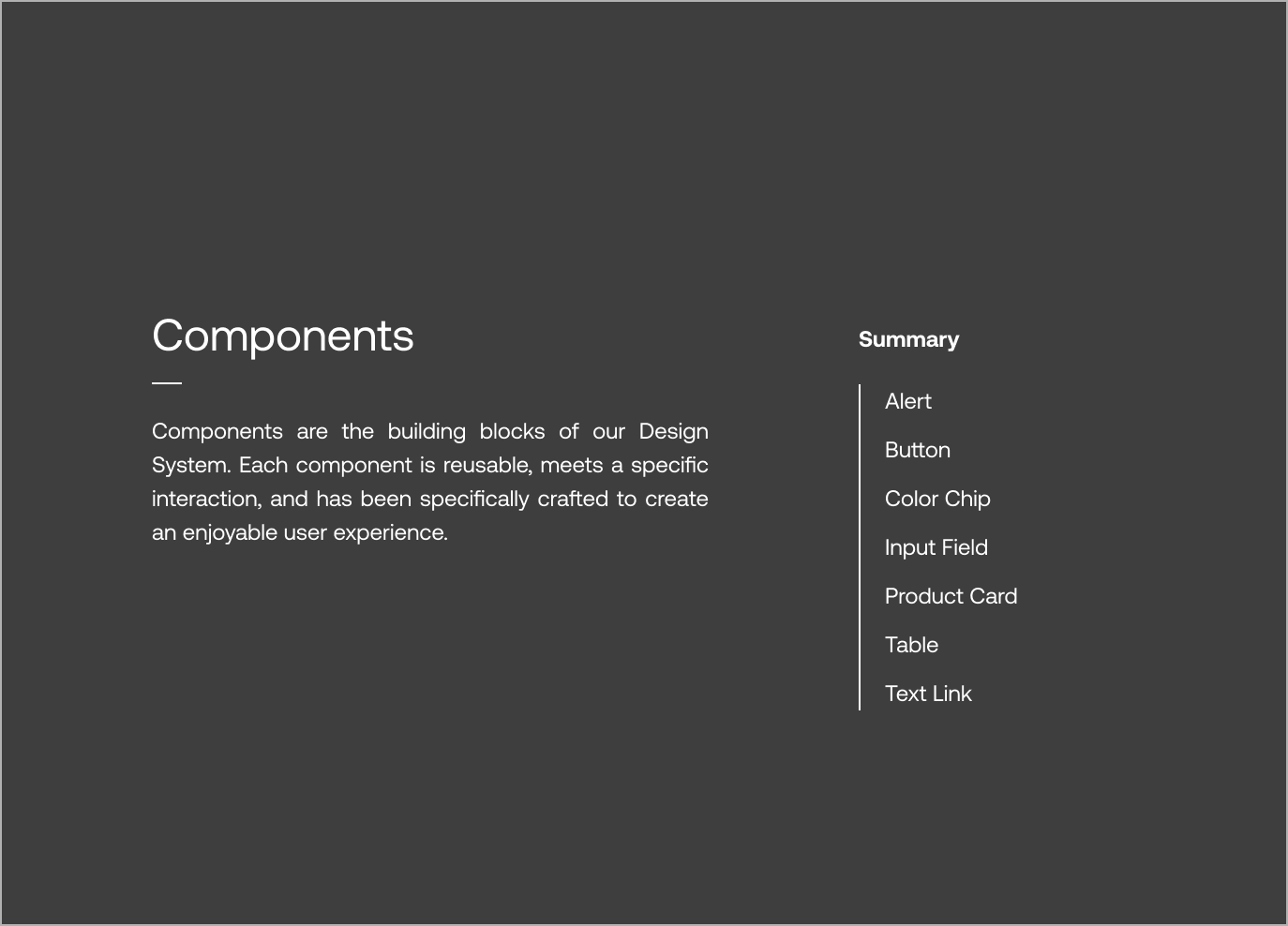
Components
Once the foundations were in place and the mockups approved, I started documenting the UI elements in the style guide. Each component included specs like dos and don’ts, sizing, and hierarchy.

Learnings
Tackle edge cases from day one
…and everything else will follow. One of the most popular styles, the “Creator,” came in more than 80 colors. Considering that from the start saved time later and helped me avoid underestimating the complexity of the flows.
Empower the user
Giving users all the information they need -even if it seems challenging at times- helps them plan their purchases and manage their own logistics.
COPYRIGHT © 2025 KARLA MARTINEZ.
These works have been distributed to you on a confidential basis for your information only. By accepting it, you agree not to disclose them to any other person or entity in any way or use the information for any purpose other than to consider business opportunities with Karla Martinez.


Projects
Explorations
About Me

Ecommerce Made Differently
Finding the balance between the complexity of a B2B solution and the sleekness of a premium fashion brand.
Product Design
Mobile first
B2B
Who's Stanley? Who's Stella?
Stanley/Stella is a Belgian company focused on sustainable, premium blank apparel for the print industry, which means they don't sell directly to the end-customer, but through a network of carefully selected Official Dealers. They wanted to redesign their webshop as their previous one didn't reflect their contemporary and innovative spirit.
My role
As a UX/UI Designer, I gathered input from multiple stakeholders to make sure the new website included all the features needed. I defined and validated user flows to guide the design of the website. I worked mostly on the Product Detail and the Product List flows, while other UX/UI colleague focused on the Check-out.
I aligned with the graphic design team (who were focused on print) to understand ST/ST's visual language. I then, translated it into a design system and component library, ensuring consistency for this and upcoming projects.
Defining the Problem
Mobile First approach
ST/ST wanted a consistent experience across desktop and mobile. The new mobile-first platform should let users complete purchases on any device.
Empowering Users
The new platform aimed to provide Official Dealers clear, real-time information so they could make informed decisions and purchase with confidence.
The Users’ habits
It was important to understand the purchase habits of the users, which differ from B2C ones.
They make regular, high-volume purchases to keep enough stock in their shops.
A single purchase often includes multiple sizes of the same style.
Demand varies by size: XS is usually bought in smaller quantities than Medium.
Users aim to reach the free-delivery threshold by buying in larger quantities.
Users’ locations determine which warehouse the system assigns to them.
A select group of users has access to extra features, such as credit lines or backordering.
User Needs and Pain Points
I started working with some initial user-stories provided by the Product Owner, that helped me understand the users' most urgent pain points. They were not linked yet to a complete flow or journey.
As a user, I want to know all the colours that exist for a specific style so that I can find the one that most suits my expectations.
As a user, I want to see the full local stock per size so that I can order my quantity accordingly.
As a user, I want to activate an alert for back in stock so that I can order when available.
As a user, I want to directly see the size range (XXS-5XL) of a style so that I know in which sizes the style is available.
As a ‘Tier A’ customer, I want to see the expected inbounds so I can plan my purchases accordingly.
I created initial users flows and discussed them with the Merchandising, Logistics and Development teams. This had two purposes: understand what buyers could do and not do and ensure that proposed solutions where feasible both technically and logistically.
Sample of how a user assigned to the local warehouse would complete a purchase. View in Whimsical.
Wireframes
The purchase flow: Happy path
This is the more straightforward path. It happens when users select models, sizes and colors that are available. Users can:
- See products’ description, pictures, size range, etc.
- Select one or more products in multiple sizes and colors.
- See availability of the selected items.
- Add order to basket.
Logged User
The purchase flow starts in the Product Detail page, by clicking the "Choose your Color/Size” CTA.
When the user stars selecting colors, a menu will appear with: CTA for continue and CTA for unselect. That menu will be fixed on bottom.
When the user adds a quantity, the menu “Add to cart” will appear. The quantity will be validated. If available, a check icon will appear.
The purchase flow: Backorders
This is a specially complex path. When the available stock is not enough to complete the users’ orders, they can:
- See current and upcoming stock (if any), to make a more informed decision
- Make a backorder, in other words, receive the product in 2 or more batches as they become available.
- Activate an alert to be notified when a product is back in stock.
Tier A Customer
The “Available Soon” toggles on/off a column with the inbounds planned for the next 3 weeks.
User can see more detail about exact dates in “planned restock” (Available soon: see more)
If the user enters a number higher than the current stock, it will be informed of a potential backorder.
If the stock is 0 and the user enters a number, the system will inform them of a potential backorder.
Out of Stock
Not all users are enabled to create backorders. They can get notified when the product is back in stock.
Order Soon
Scenario: Product ran out of stock after the quantity was checked, but before it was sent to cart.
After trying to add to cart, an error message will appear. It will also provide the option to go back.
The Final Designs
Desktop
After the wireframes were validated, I moved on to the final designs. I spent time benchmarking other fashion e-commerce sites to understand current visual trends and best practices.
The flows and features stayed the same, but I refined the layouts and patterns, especially for desktop.
Component Library
The component library in Figma was built and documented alongside the design work. Once a screen was approved by all stakeholders, I documented its components and variants to keep everything consistent and easy to update.
Foundations
This section covered the building blocks of the design system (colors, typography, grid, icons, etc.) that shaped all the components and screens to follow.
Components
Once the foundations were in place and the mockups approved, I started documenting the UI elements in the style guide. Each component included specs like dos and don’ts, sizing, and hierarchy.
Learnings
Tackle edge cases from day one
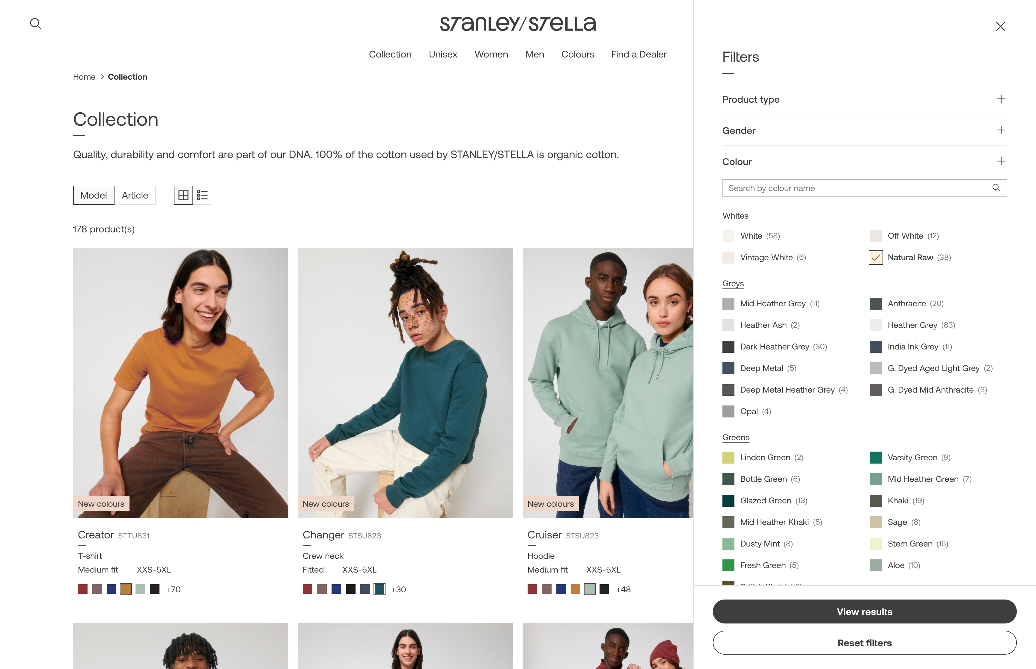
…and everything else will follow. One of the most popular styles, the “Creator,” came in more than 80 colors. Considering that from the start saved time later and helped me avoid underestimating the complexity of the flows.
Empower the user
Giving users all the information they need -even if it seems challenging at times- helps them plan their purchases and manage their own logistics.
←
Back to Projects
Next Project
→
COPYRIGHT © 2025 KARLA MARTINEZ.
These works have been distributed to you on a confidential basis for your information only. By accepting it, you agree not to disclose them to any other person or entity in any way or use the information for any purpose other than to consider business opportunities with Karla Martinez.