


Redwood Design System
How to redesign dozens of products of a decade-long company without affecting their features, performance or data?
Designing a corporate big scale design system from scratch.
UI Design
Design Systems
Figma
The Challenge
Oracle Corporation is a multinational company, based in the United States. In terms of revenue, it’s the third largest software company in the world. Founded in 1977, provides software and cloud engineered systems to enterprises, among other products.
The challenge was to redesign most of their products (that have been there for several decades) without affecting the features, performance or data that thousands of people use on a daily basis.
Redwood Design System was created to solve this.
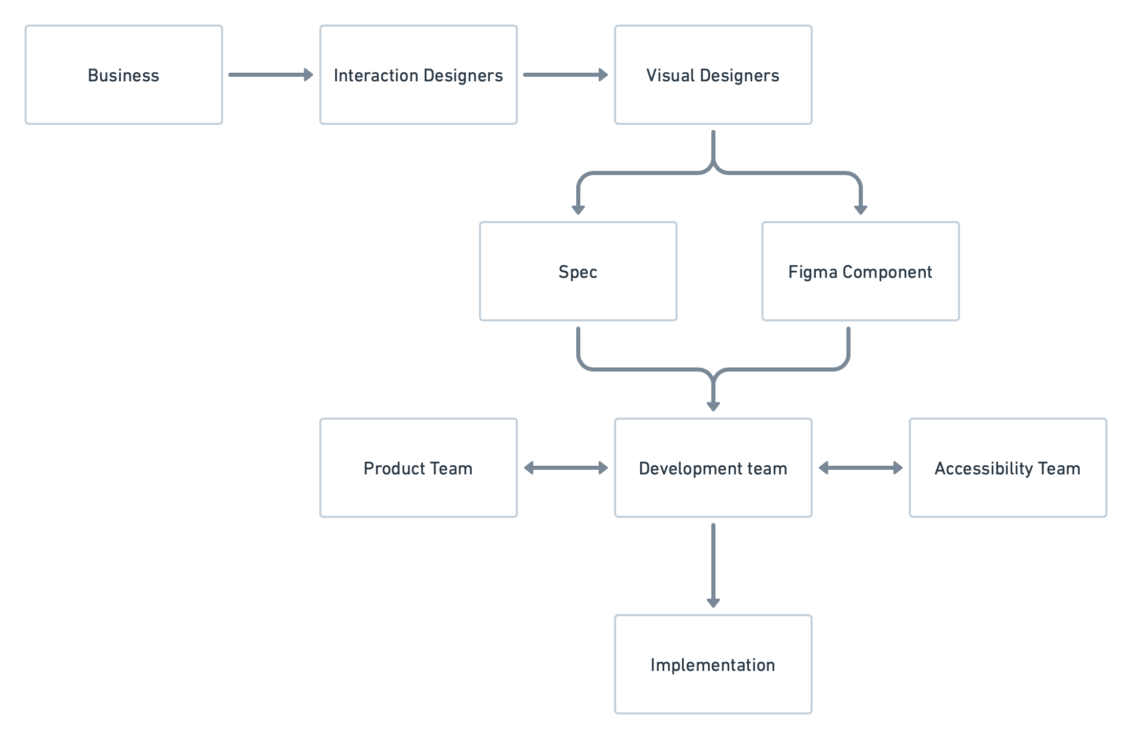
My role
As a Senior Visual (UI) Designer, I was part of a team in charge of the creation of components, guidelines and patterns for the Design System. I collaborated closely with stakeholders such as Product and Accessibility Teams in order to create the Components needed and their detailed Specs, for the Developers to implement them into live code.
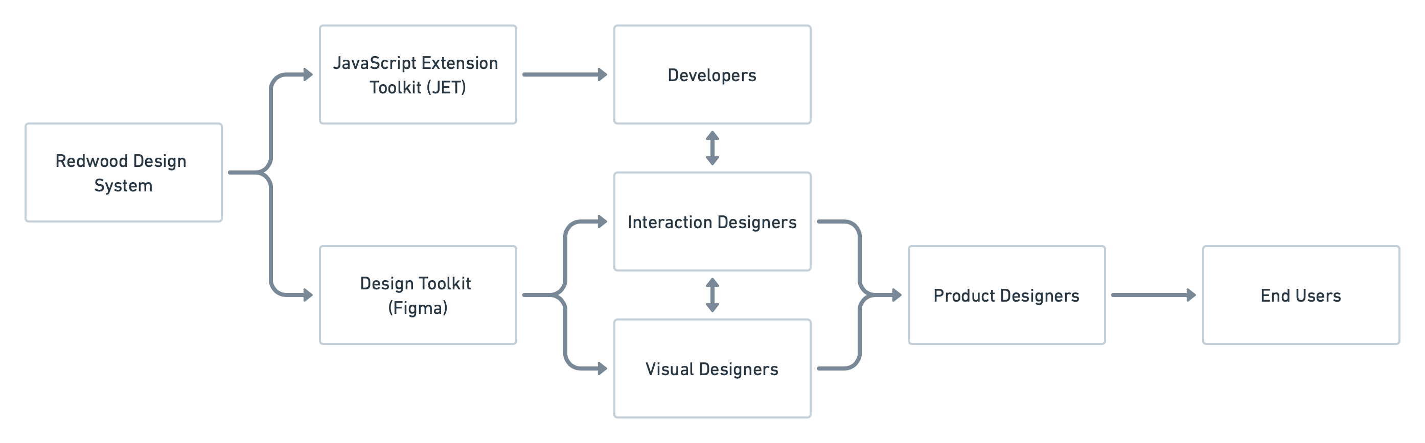
Design System Organization
The Redwood Design System (RDS) was divided in two main sections, one was our beloved ❤️ Design Library builded in Figma. This one was used by Product Designers at Oracle to create products for our End Users.
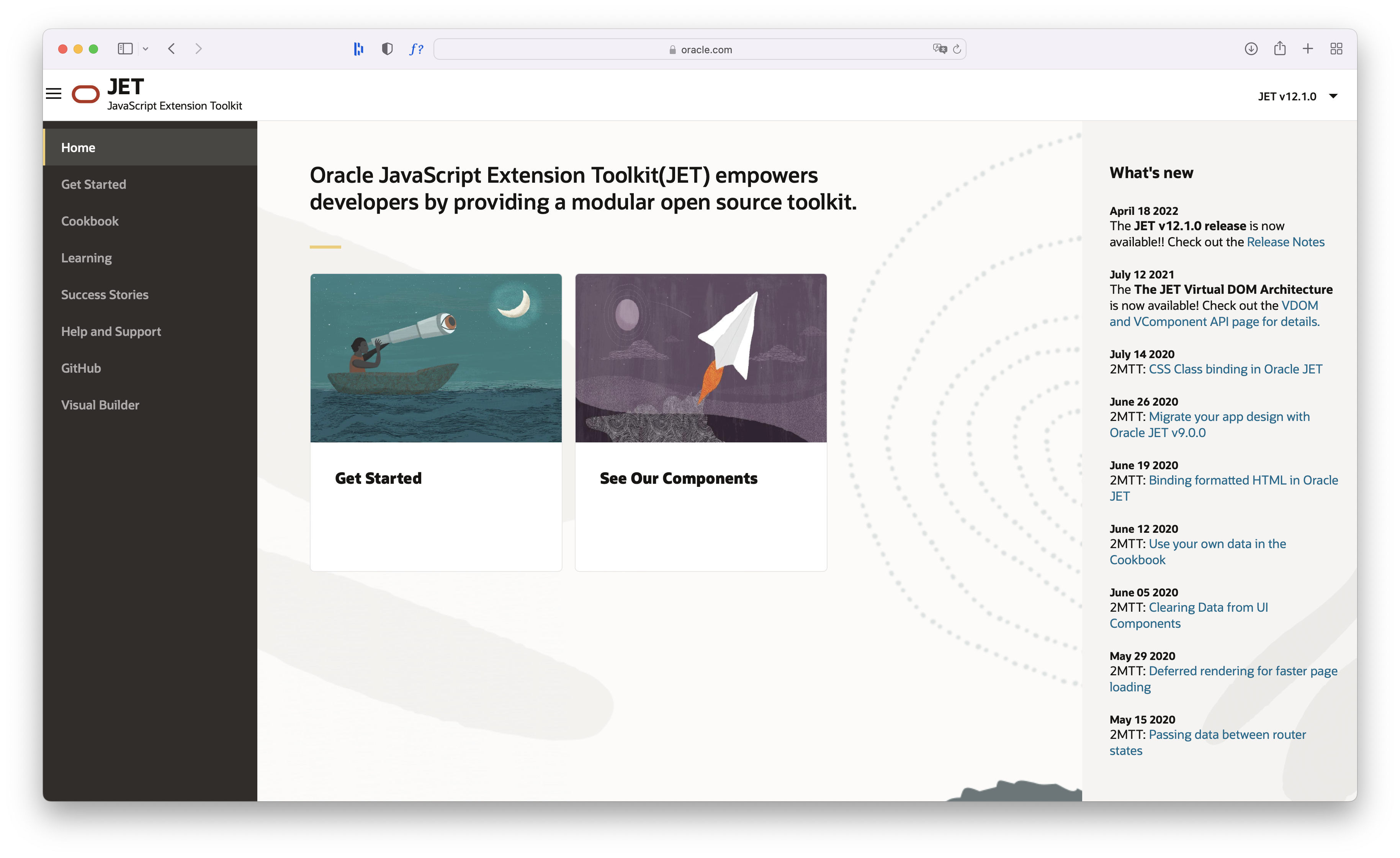
And the other one was Oracle JavaScript Extension Toolkit (JET), a framework based on JavaScript, HTML5, and CSS which was used by developers to build web and hybrid mobile apps based on the content of our Design Library.
Design Toolkit (Figma)
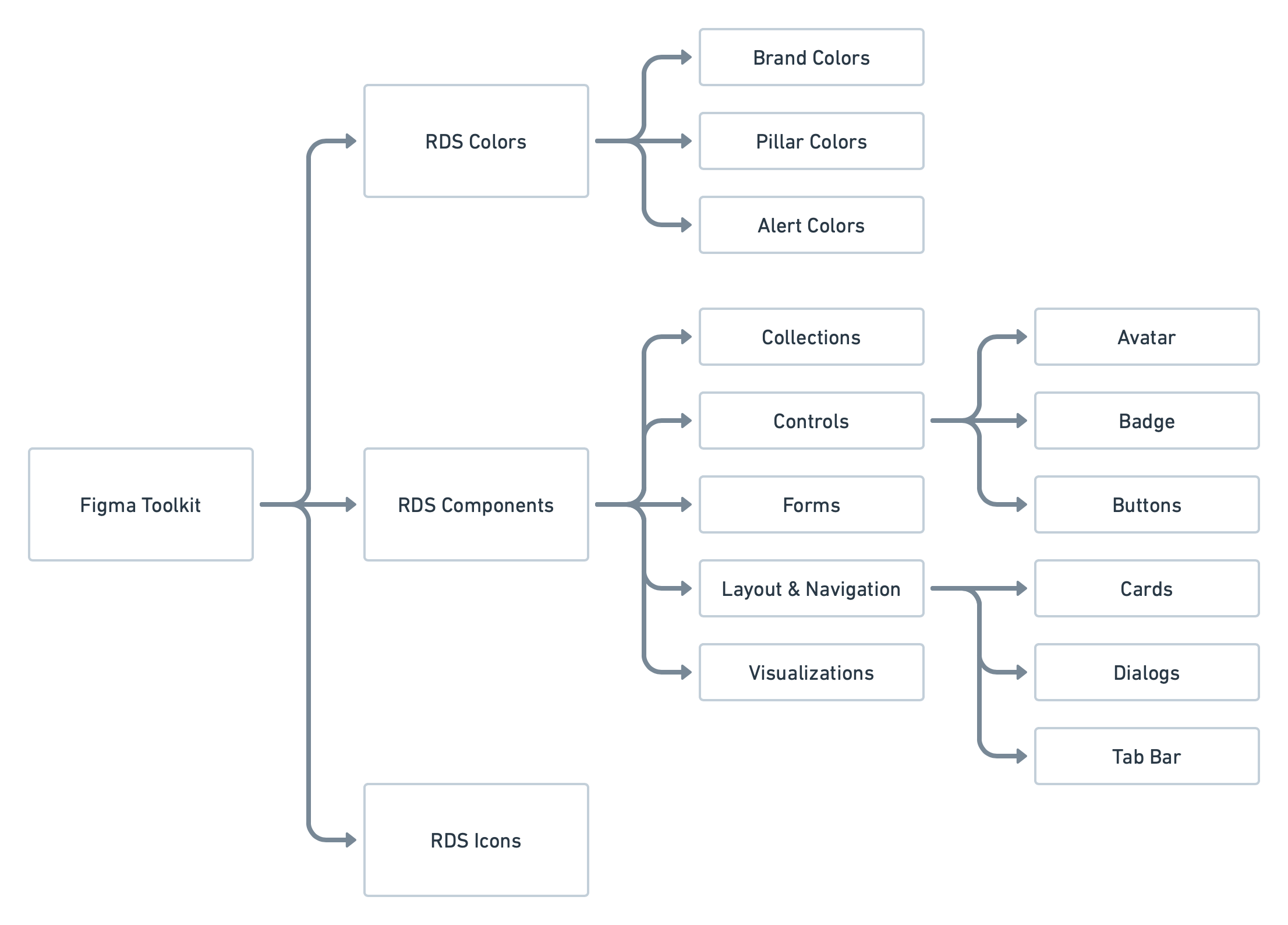
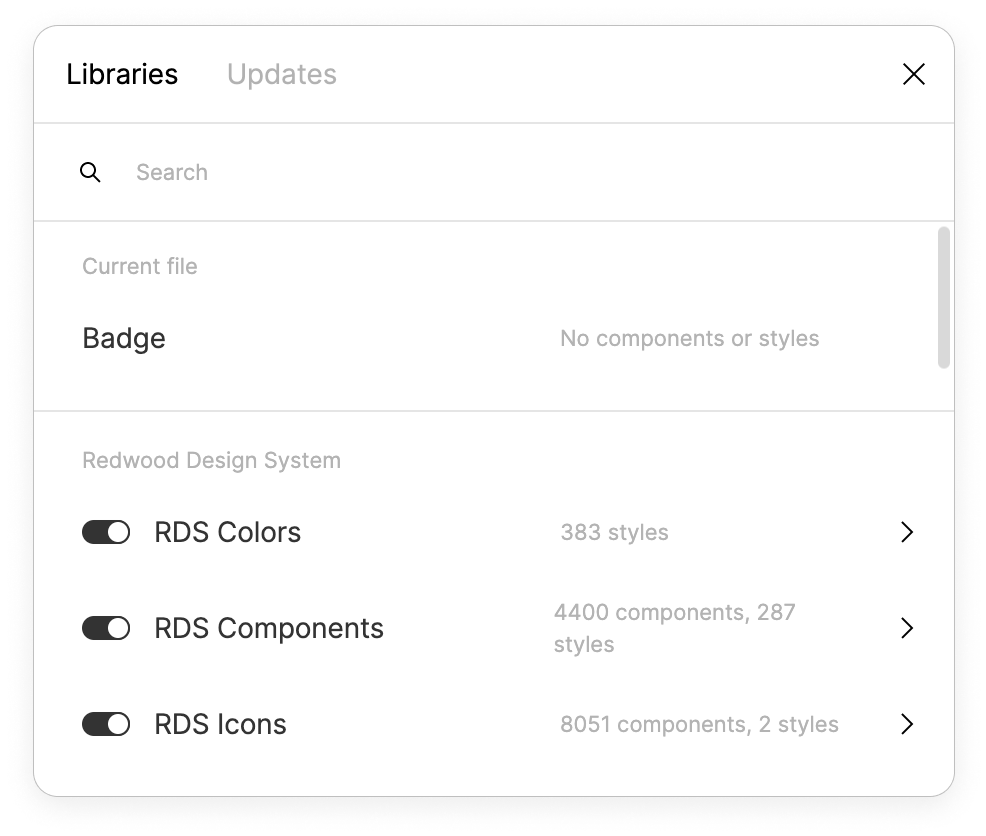
The Toolkit was created in Figma and was divided into three main Figma Libraries: RDS Colors, RDS Components and RDS Icons.
Components
Our main library contained all of our components and was accessible to everyone on the Oracle Design Team: accessibility specialists, project managers, product designers, and more. It was organized into five main categories: Collections, Controls, Forms, Layout & Navigation, and Visualizations.
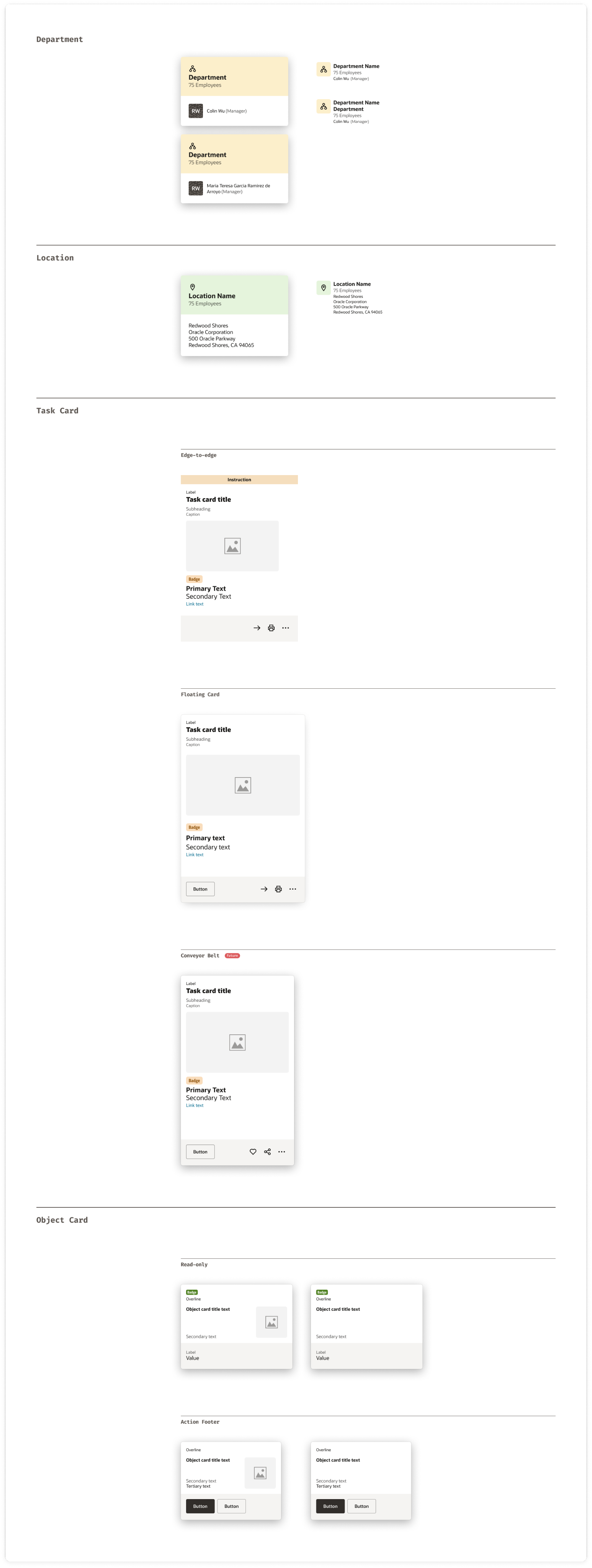
Collections: Card Component
Collections are components that help to organize large amounts of data.
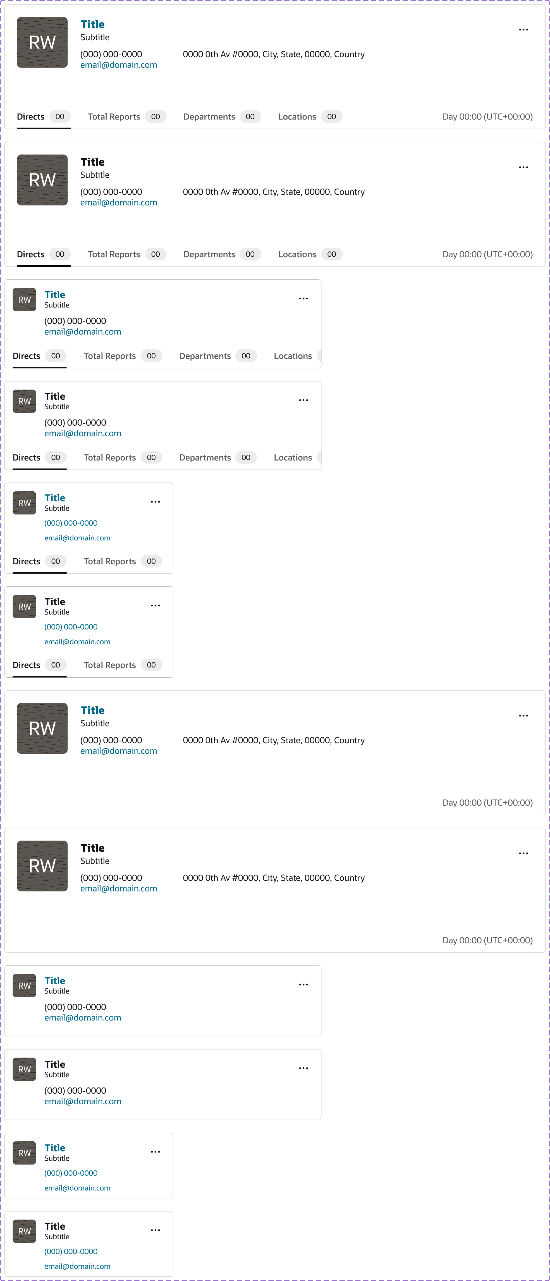
This is the component sheet for the Card component. It outlined not just the specs for a single card, but all its variants: default, selected, and contextual uses like in a carousel, as a floating card, or in an edge-to-edge layout.
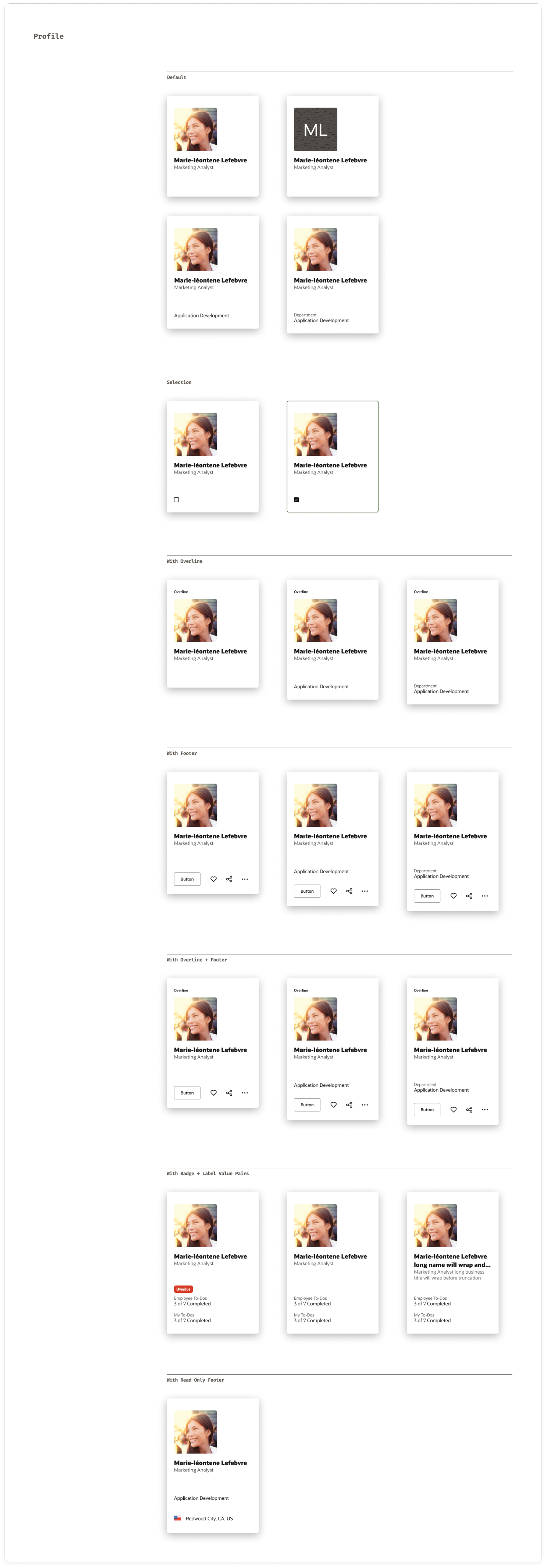
Controls
A Control is a component that helps the user to trigger an action within the interface.
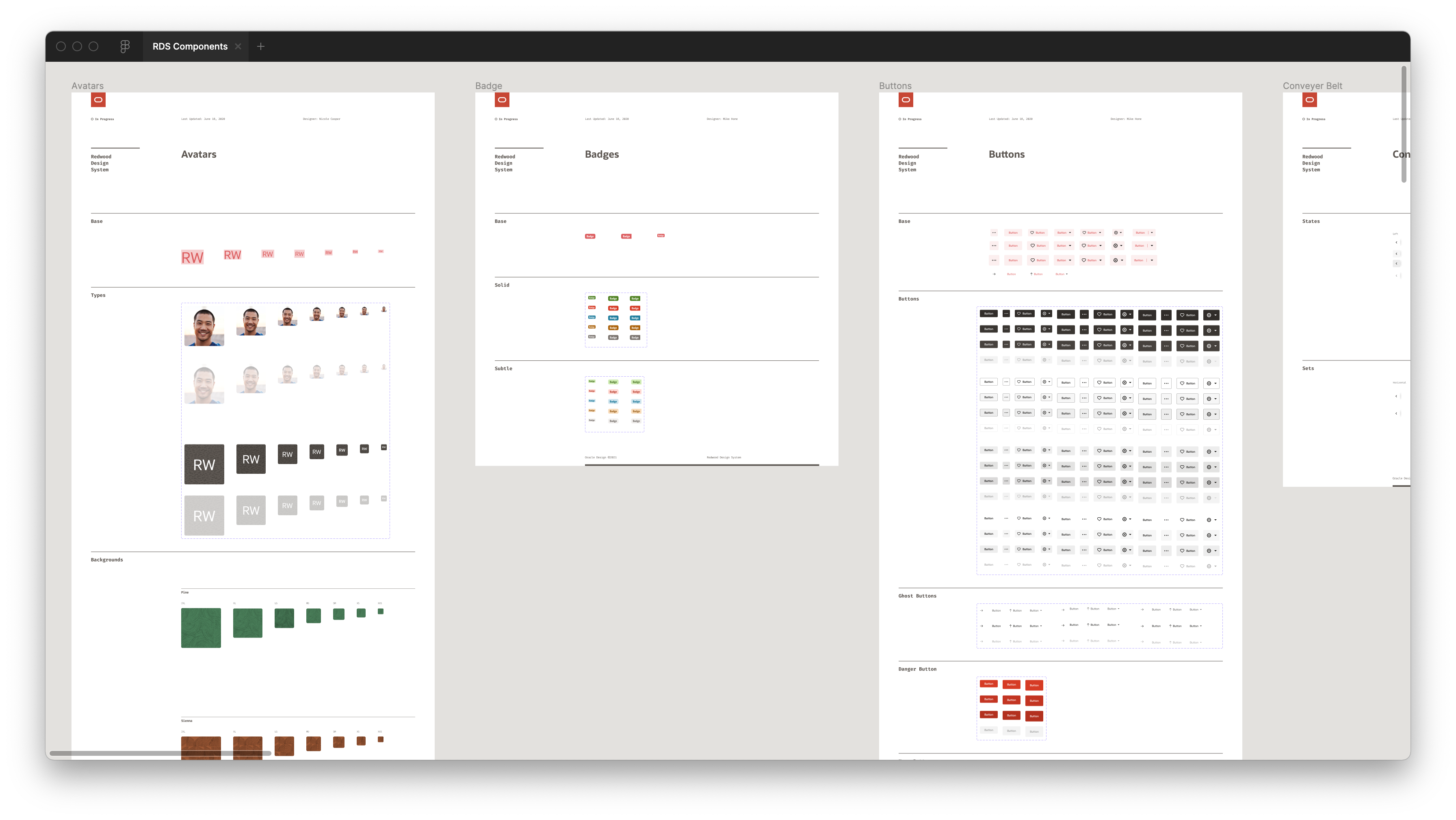
This is an overview of the Controls page within the Figma library. Avatars, Badges and Buttons are pictured.
Layout and Navigation
Layout & Navigation are complex components that help navigate through an interface.
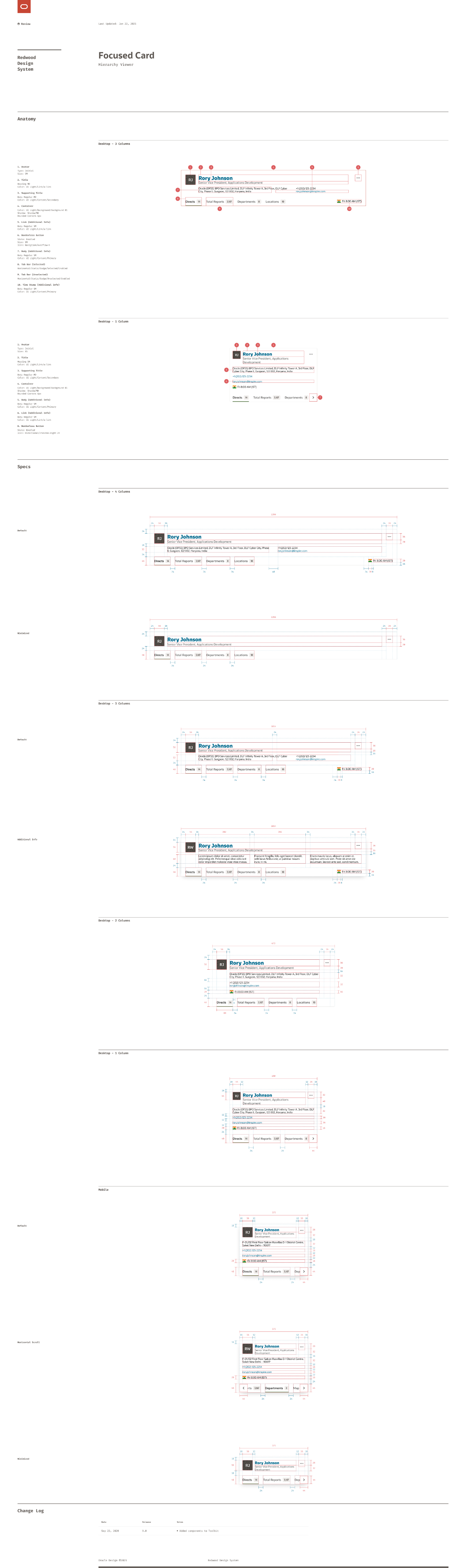
This is the component sheet for the Hierarchy Viewer and, specifically, its Focused Card. Along with the component and its variants in Figma, I documented its anatomy: the smaller parts it was built from, like Avatars and Buttons—as well as the redlines.
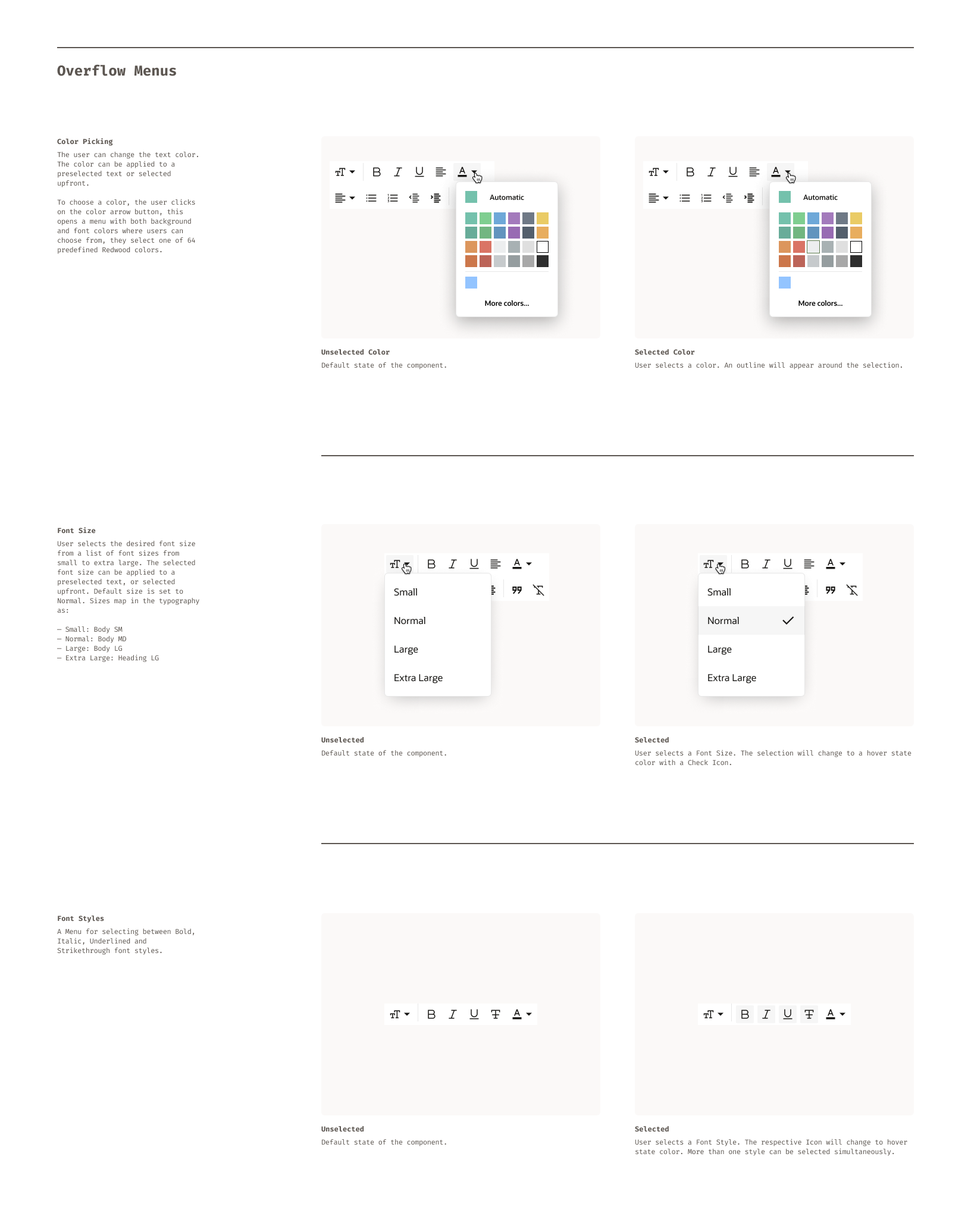
Specs
In addition to the component sheets shown above, we also created detailed documentation or Specs for interactive components. These included notes on behaviors, patterns, and transitions (how elements responded to clicks, hovers, and focus states) to ensure a consistent experience across the system.
Rich Text Editor
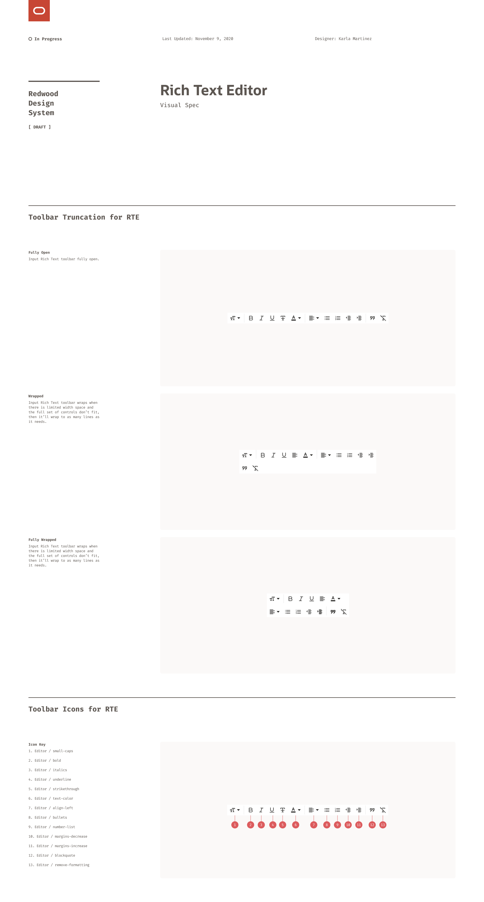
This is a spec sheet for the Rich Text Editor component. Besides technical details like redlines, anatomy, and variants, it also addressed the user experience and interactions.
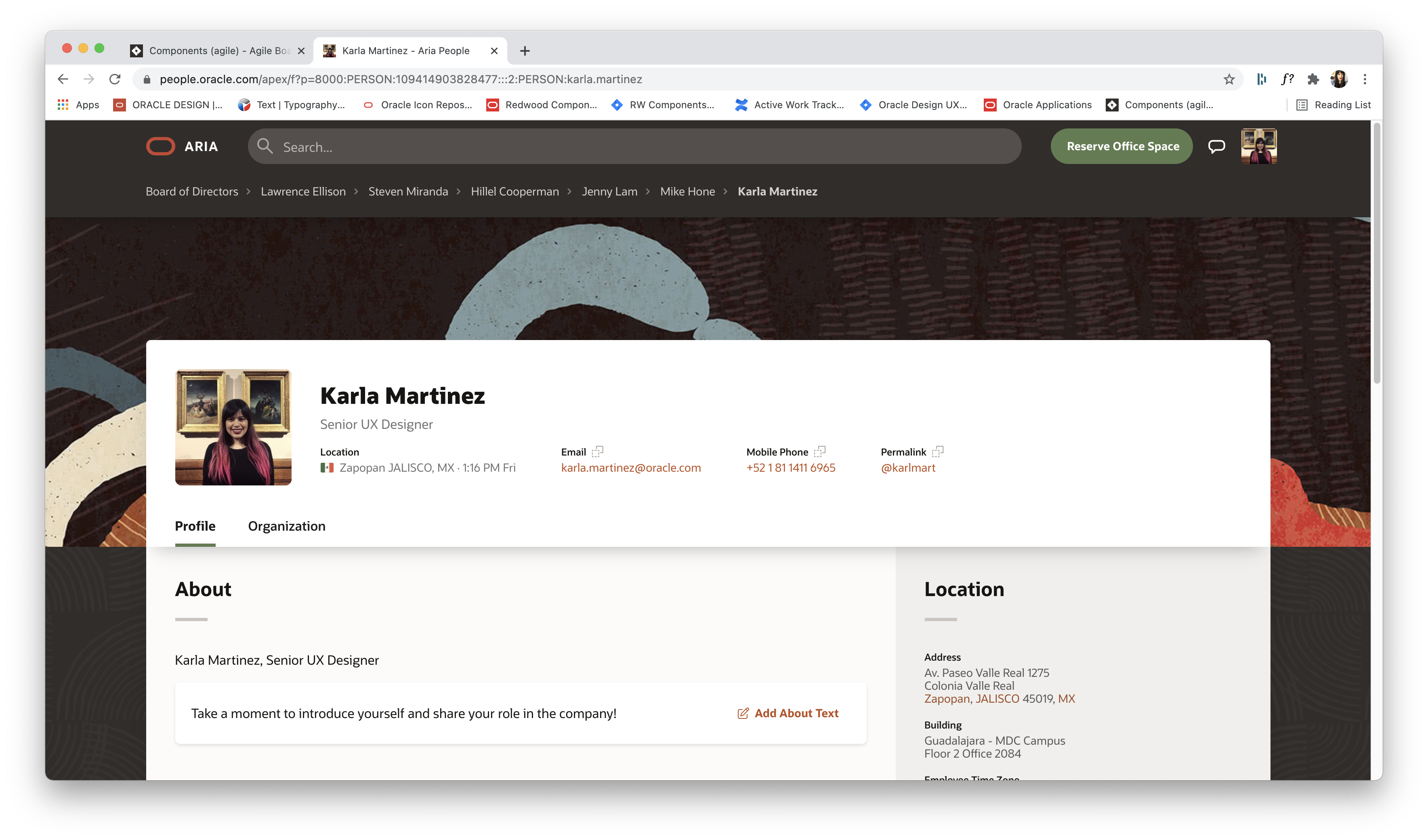
In Action
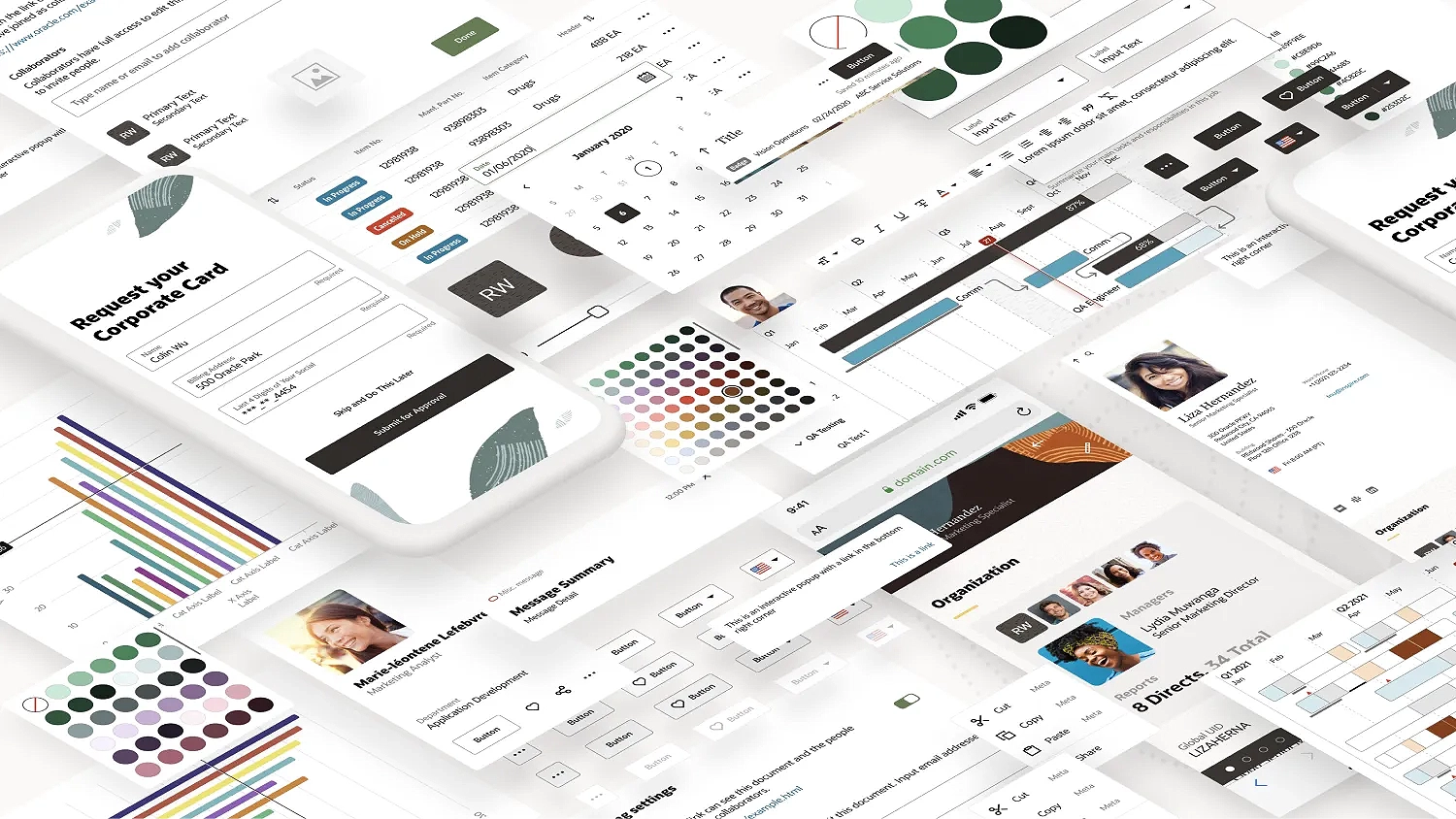
This is an actual product for Oracle. It showcases a variety of components of the RDS in action.
Outcomes
Redwood Design System was widely used within the organization. More that 200 Designers across 20 Product teams were using it on a daily basis for the creation of their products.
Additionally, the project won the 2021 San Francisco Design Week Award in the category of User Experience.
COPYRIGHT © 2025 KARLA MARTINEZ.
These works have been distributed to you on a confidential basis for your information only. By accepting it, you agree not to disclose them to any other person or entity in any way or use the information for any purpose other than to consider business opportunities with Karla Martinez.


Projects
Explorations
About Me

Redwood Design System
How to redesign dozens of products of a decade-long company without affecting their features, performance or data?
Designing a corporate big scale design system from scratch.
UI Design
Design Systems
Figma
The Challenge
Oracle Corporation is a multinational company, based in the United States. In terms of revenue, it’s the third largest software company in the world. Founded in 1977, provides software and cloud engineered systems to enterprises, among other products.
The challenge was to redesign most of their products (that have been there for several decades) without affecting the features, performance or data that thousands of people use on a daily basis.
Redwood Design System was created to solve this.
My role
As a Senior Visual (UI) Designer, I was part of a team in charge of the creation of components, guidelines and patterns for the Design System. I collaborated closely with stakeholders such as Product and Accessibility Teams in order to create the Components needed and their detailed Specs, for the Developers to implement them into live code.
Design System Organization
The Redwood Design System (RDS) was divided in two main sections, one was our beloved ❤️ Design Library builded in Figma. This one was used by Product Designers at Oracle to create products for our End Users.
And the other one was Oracle JavaScript Extension Toolkit (JET), a framework based on JavaScript, HTML5, and CSS which was used by developers to build web and hybrid mobile apps based on the content of our Design Library.
Design Toolkit (Figma)
The Toolkit was created in Figma and was divided into three main Figma Libraries: RDS Colors, RDS Components and RDS Icons.
Components
Our main library contained all of our components and was accessible to everyone on the Oracle Design Team: accessibility specialists, project managers, product designers, and more. It was organized into five main categories: Collections, Controls, Forms, Layout & Navigation, and Visualizations.
Collections: Card Component
Collections are components that help to organize large amounts of data.
This is the component sheet for the Card component. It outlined not just the specs for a single card, but all its variants: default, selected, and contextual uses like in a carousel, as a floating card, or in an edge-to-edge layout.
Controls
A Control is a component that helps the user to trigger an action within the interface.
This is an overview of the Controls page within the Figma library. Avatars, Badges and Buttons are pictured.
Layout and Navigation
Layout & Navigation are complex components that help navigate through an interface.
This is the component sheet for the Hierarchy Viewer and, specifically, its Focused Card. Along with the component and its variants in Figma, I documented its anatomy: the smaller parts it was built from, like Avatars and Buttons—as well as the redlines.
Specs
In addition to the component sheets shown above, we also created detailed documentation or Specs for interactive components. These included notes on behaviors, patterns, and transitions (how elements responded to clicks, hovers, and focus states) to ensure a consistent experience across the system.
Rich Text Editor
This is a spec sheet for the Rich Text Editor component. Besides technical details like redlines, anatomy, and variants, it also addressed the user experience and interactions.
In Action
This is an actual product for Oracle. It showcases a variety of components of the RDS in action.
Outcomes
Redwood Design System was widely used within the organization. More that 200 Designers across 20 Product teams were using it on a daily basis for the creation of their products.
Additionally, the project won the 2021 San Francisco Design Week Award in the category of User Experience.
←
Back to Projects
Next Project
→
COPYRIGHT © 2025 KARLA MARTINEZ.
These works have been distributed to you on a confidential basis for your information only. By accepting it, you agree not to disclose them to any other person or entity in any way or use the information for any purpose other than to consider business opportunities with Karla Martinez.