


Redesign and
Design System
Coppel is one of the largest retail companies in Mexico.
The project consisted in the redesign of their website and shopping experience, along with a Design System.
UI Design
Design Systems
Ecommerce
The Problem(s)
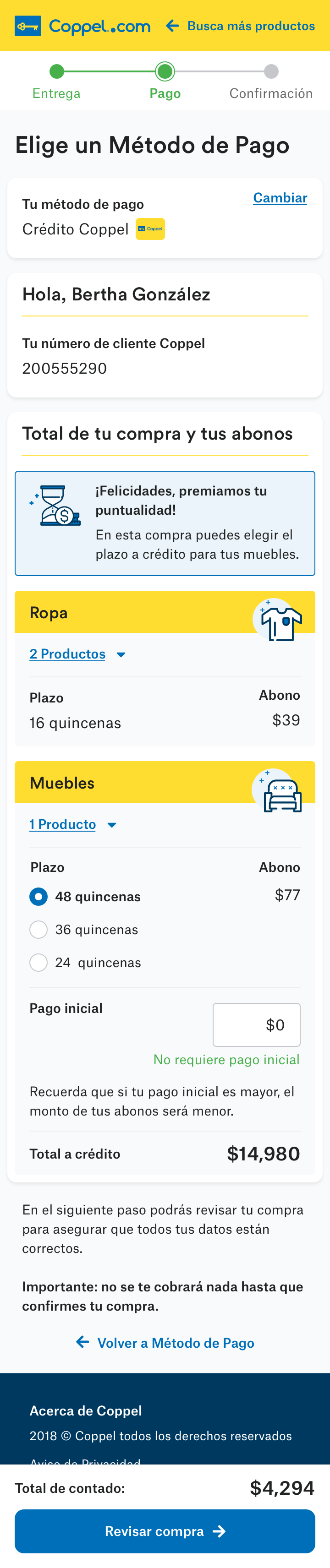
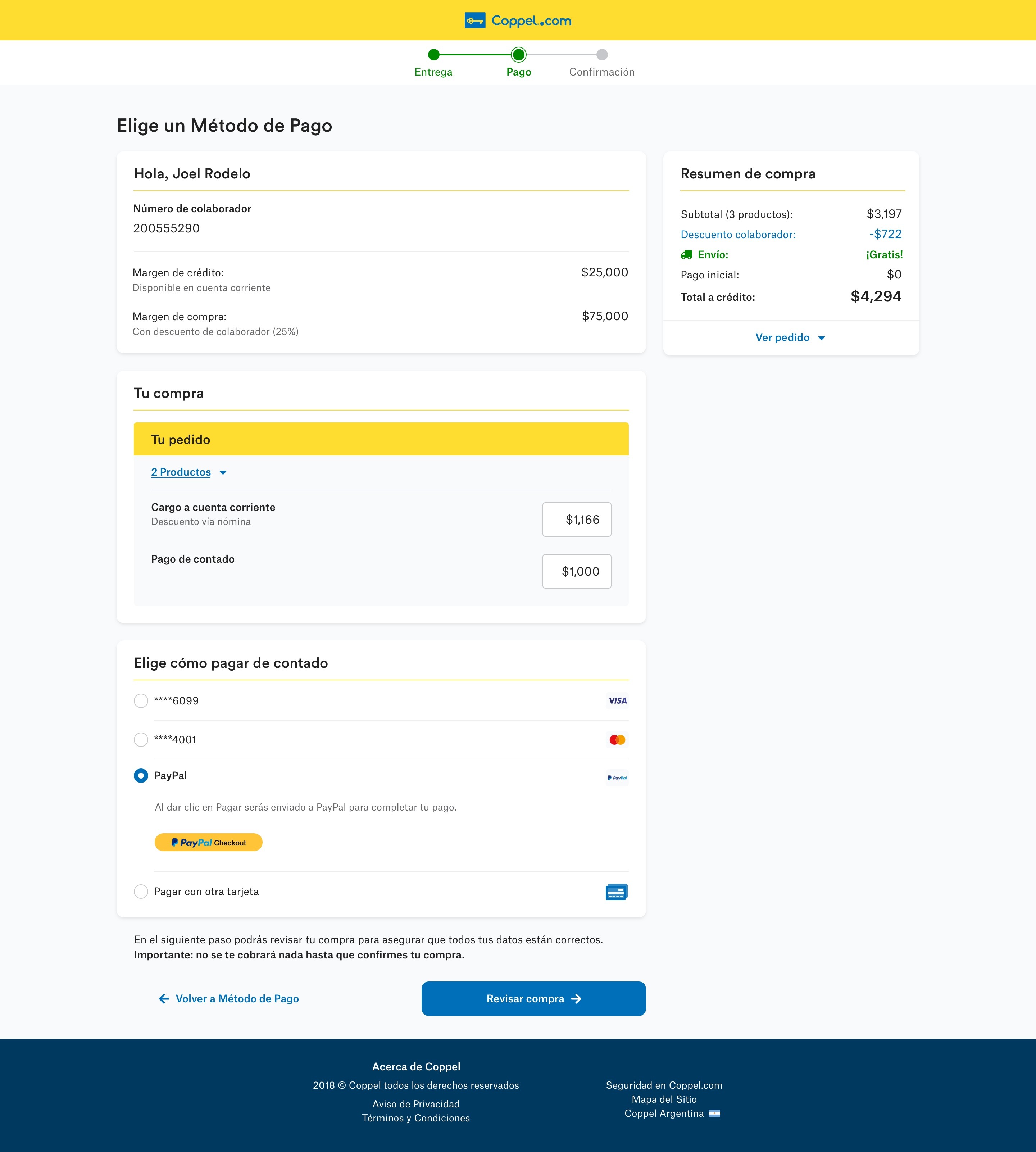
Purchase Flow
The client had noticed that users were exploring products and adding them to their carts, but many didn’t finish their purchases. Something in the checkout flow was creating friction, and we wanted to understand what was getting in their way.
Inconsistencies
As Coppel introduced its new brand look, we noticed that the website wasn’t fully aligned. Some design elements felt inconsistent across pages and platforms, which made the experience feel less unified than we wanted.
Performance
With more than three million people visiting the site every day, we knew performance mattered. In Mexico, not everyone has access to a strong internet connection, so the team focused on making the site faster, lighter, and accessible for everyone.
The solution consisted in redesigning the entire webpage with focus on the purchase flow. In addition, we proposed to deliver a design system in order to tackle design inconsistencies and performance issues.
The Process
Understand the Brand
The first step was to collect all the guidelines and material the client had.
In this case, Coppel had had a recent rebrand, so they had very complete documentation about the “DNA of the brand”; it included tone, imagery use, typography, color, brand values and a manifesto. They also provided their printed and digital media guidelines.
Understand its Ecosystem
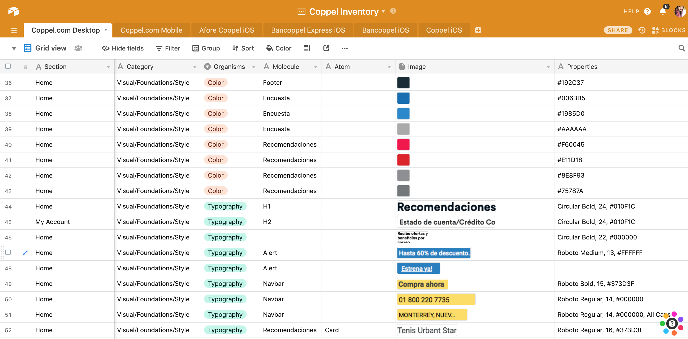
We soon learnt that Coppel’s digital ecosystem consisted not only of the webpage but also of the iOS app, Android app and at least another 3 sub-brand products. As we wanted to build something that could scale in the future, I did an Interface Inventory, which is “a comprehensive collection of the bits and pieces that make up your interface”. This was an important step at the beginning of the project because it gave me and the client a better idea of how complex the design system was going to be.
To complete the inventory, I went through Coppel’s website and apps, took screenshots of every component (e.g. buttons, headers, toggles) and then used AirTable to categorize them.
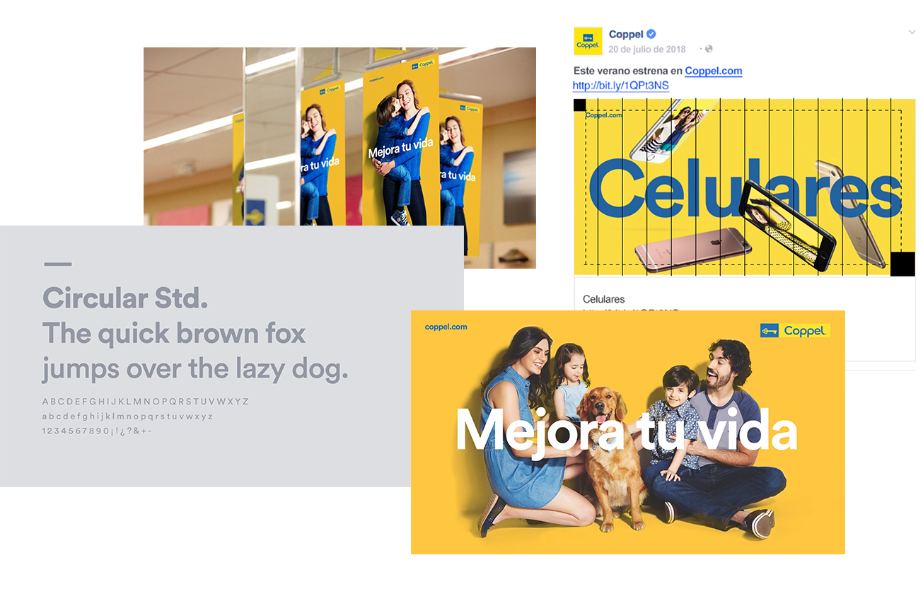
Set the Mood(board)
A Moodboard is a collage of images, textures, patterns and sometimes even objects. Its purpose is to establish the aesthetic feel of a design project.
I focused on collecting examples of web applications that used the same typography than the brand (Circular Std.) and collected examples of good yellow color usage. I also included printed media that paired the Circular typography with another one.
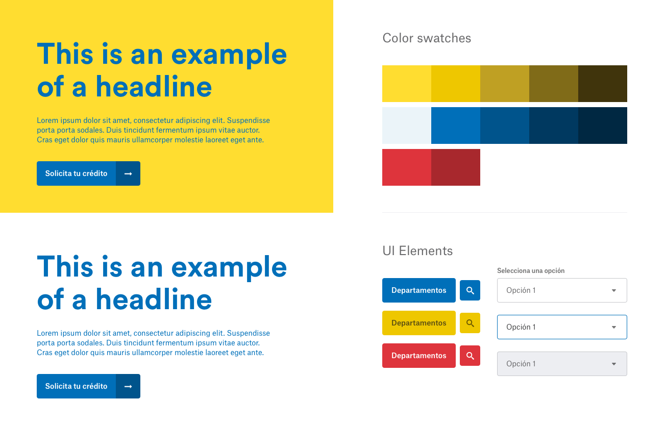
Create a Style Tile
A Style Tile is a design deliverable consisting of fonts, colors and interface elements that communicate the essence of a visual brand for the web. These are not a structured or finished webpage but proposals to accelerate getting feedback from the client and avoid rework later.
The tile I presented to the client covered:
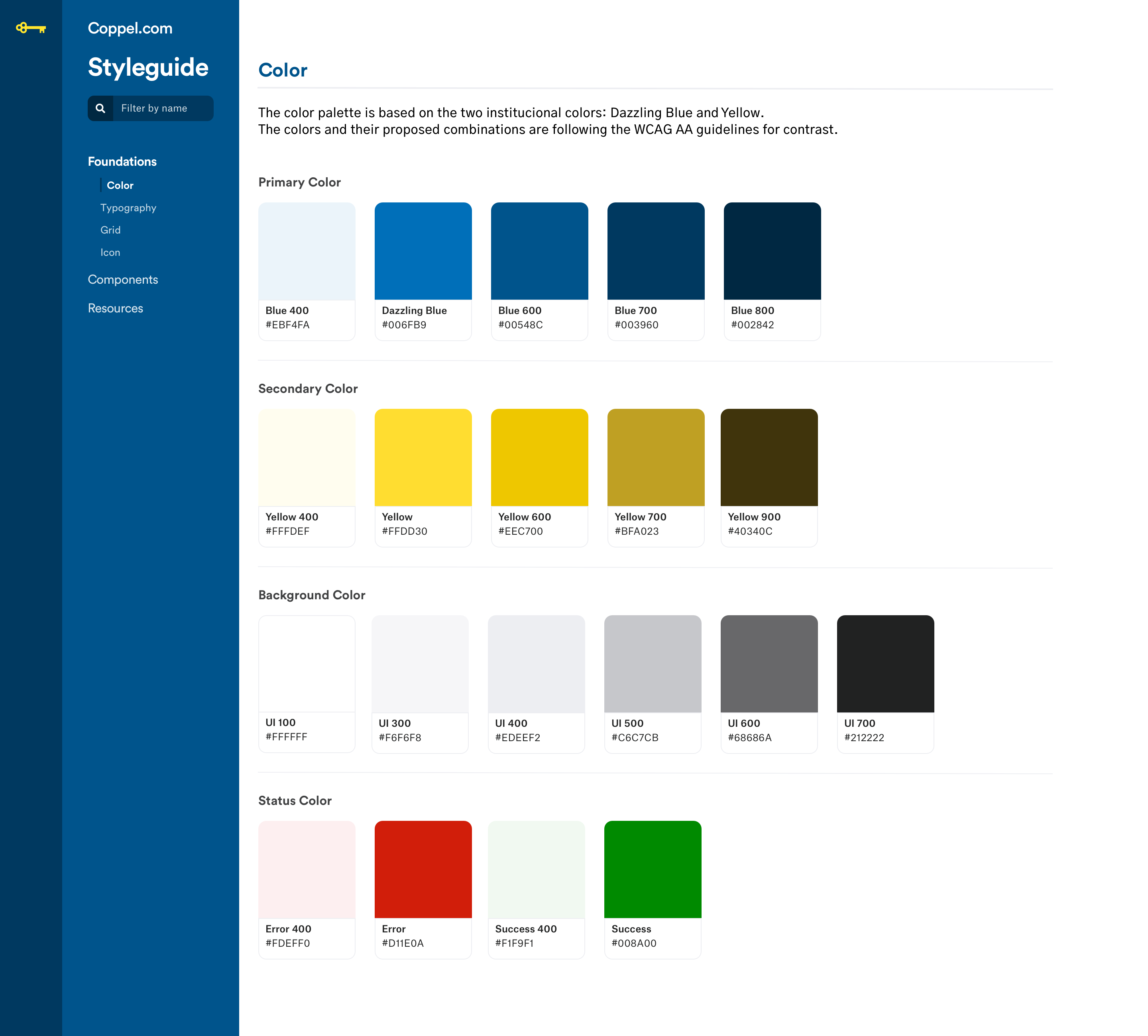
- The color palette proposal, based on their brand (with a focus on contrast for accessibility).
- Font exploration and examples of how the color could be used with the typography.
- Look and feel for buttons using very rounded corners for matching their logo, which uses circles and rounded finishes.
The Final Designs
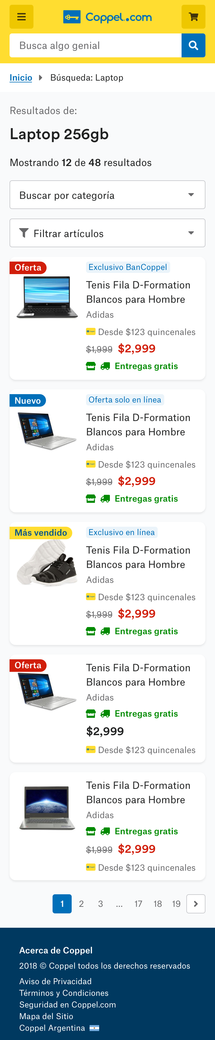
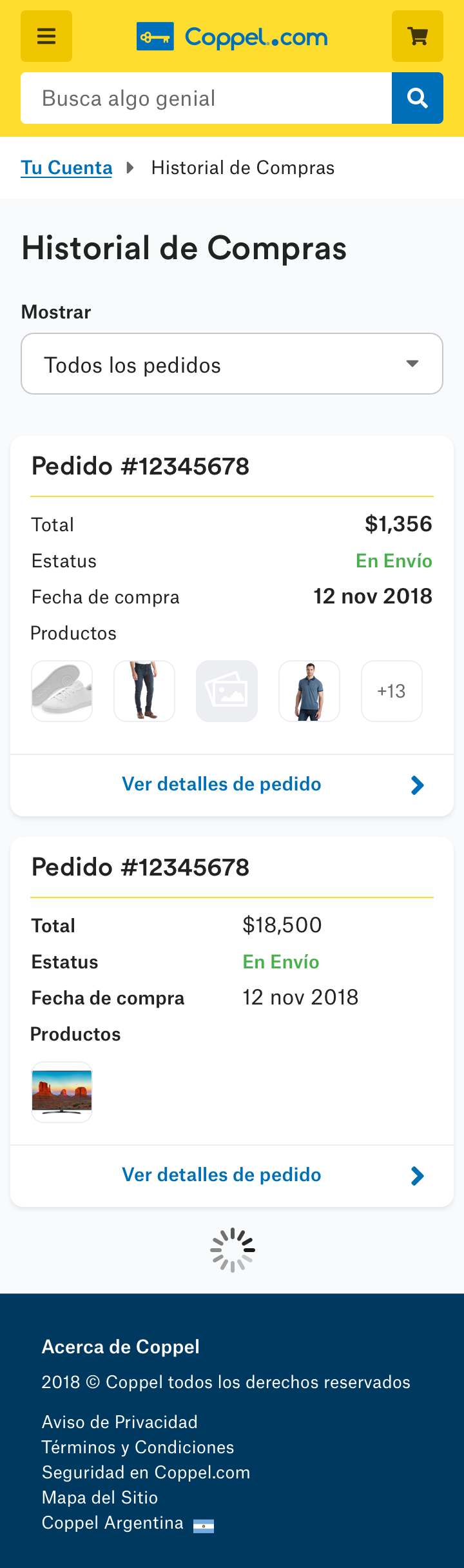
Mobile First
We were working on an Agile environment so, in order to optimize time, all the processes above happened while the UX Designers were working on the wireframes. As soon as the wireframes were tested and validated, I started creating the first mockups proposals.
According to analytics, most of their users access the site on their phones, so we build with a mobile-first approach.
Desktop
After the mobile mockups were validated, I proceeded to design the desktop version. It followed similar design principles that the mobile one, but with its own properties (e.g., a 12 columns grid layout).
The Design System
The system was composed of two main deliverables: the detailed documentation of the design components and their properties, called Styleguide, and the system of live components in code. Likewise, the Styleguide was divided in two main sections: Foundations and Components.
Foundations
This section consisted of colors, typography styles, grid and icons that were used as building blocks for the design components.
Components
Once the foundations were stablished and the mockups were validated, I started documenting the UI elements or components into the style guide among its specs: use cases, do's and don'ts, sizing, hierarchy, etc.
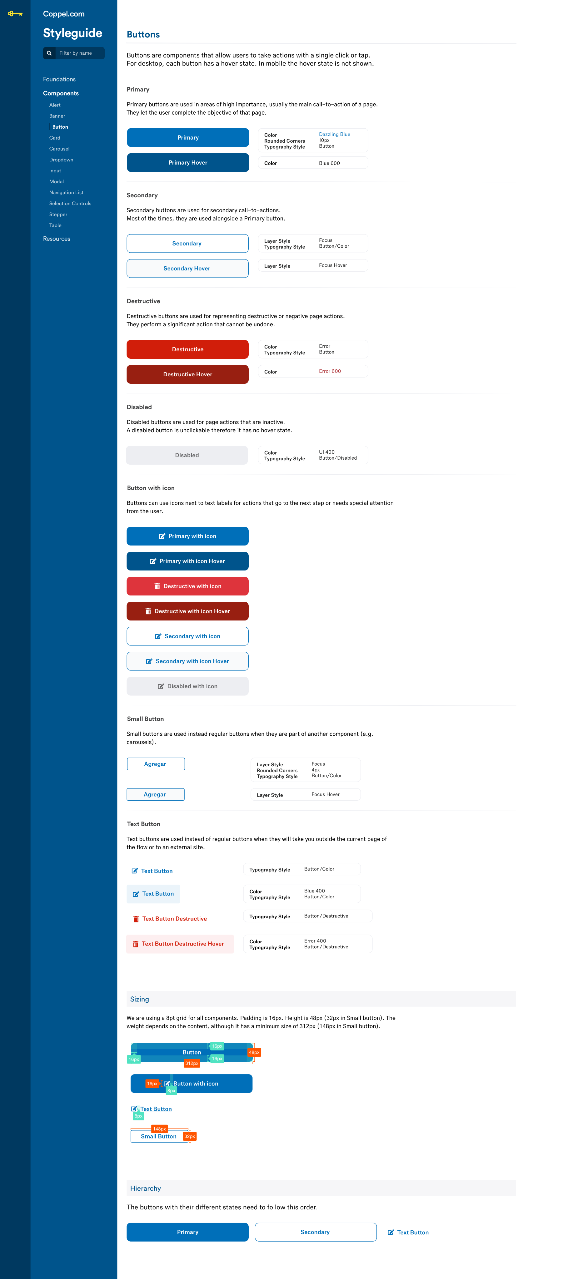
Atomic Designed
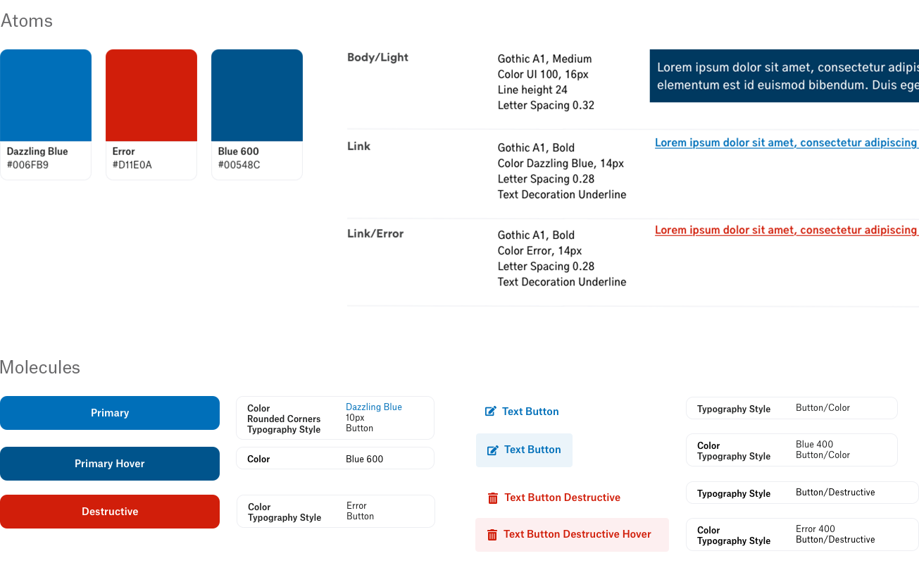
On a high level the atomic design methodology consists in breaking an interface down into its basic components, and then reuse them throughout the site. In this example, all 3 buttons are using the same character style. And the colors they’re made of are also an atom that is reused in the text links as well.
Learnings
This project took place between November 2018 and May 2019 -and yes, time really does fly, especially in tech. Today, design systems have become a staple across teams, and tools like Figma have made the process much more streamlined.
With that in mind, it might not be worth diving into the old Sketch-InVision-Zeplin-Abstract setup I used to design and collaborate with the development team. But the research, soft skills, and lessons learned from that time still feel just as relevant.
If it's not documented, it doesn't exist.
I worked in this project during my time at Wizeline, a consultancy. This redesign and its system were made for the in-house team at Coppel to adopt it, use it and scale it, so we had to be sure that every design decision was documented, otherwise all the reasoning and effort behind those agreements could be lost in the hand-off.
Don't build for the sake of build.
I spent time creating a Pagination component (with all their states) only to later be informed by the dev team that the best solution was infinite scrolling. After that, I stablished a practical rule: only detail variants and document components that were already part of a validated screen. Yes, the order matters. Be sure to always involve business.
Be realistic.
At first, I proposed a licensed typeface ignoring that we were on a budget. Fortunately, I later found a free alternative that meet the requirements, but the lesson stays: consider the limitations of the project, whatever they are (budget, time, etc.) and get through it.
←
Back to Projects
COPYRIGHT © 2025 KARLA MARTINEZ.
These works have been distributed to you on a confidential basis for your information only. By accepting it, you agree not to disclose them to any other person or entity in any way or use the information for any purpose other than to consider business opportunities with Karla Martinez.


Projects
Explorations
About Me

Redesign and
Design System
Coppel is one of the largest retail companies in Mexico.
The project consisted in the redesign of their website and shopping experience, along with a Design System.
UI Design
Design Systems
Ecommerce
The Problem(s)
Purchase Flow
The client had noticed that users were exploring products and adding them to their carts, but many didn’t finish their purchases. Something in the checkout flow was creating friction, and we wanted to understand what was getting in their way.
Inconsistencies
As Coppel introduced its new brand look, we noticed that the website wasn’t fully aligned. Some design elements felt inconsistent across pages and platforms, which made the experience feel less unified than we wanted.
Performance
With more than three million people visiting the site every day, we knew performance mattered. In Mexico, not everyone has access to a strong internet connection, so the team focused on making the site faster, lighter, and accessible for everyone.
The solution consisted in redesigning the entire webpage with focus on the purchase flow. In addition, we proposed to deliver a design system in order to tackle design inconsistencies and performance issues.
The Process
Understand the Brand
The first step was to collect all the guidelines and material the client had.
In this case, Coppel had had a recent rebrand, so they had very complete documentation about the “DNA of the brand”; it included tone, imagery use, typography, color, brand values and a manifesto. They also provided their printed and digital media guidelines.
Understand its Ecosystem
We soon learnt that Coppel’s digital ecosystem consisted not only of the webpage but also of the iOS app, Android app and at least another 3 sub-brand products. As we wanted to build something that could scale in the future, I did an Interface Inventory, which is “a comprehensive collection of the bits and pieces that make up your interface”. This was an important step at the beginning of the project because it gave me and the client a better idea of how complex the design system was going to be.
To complete the inventory, I went through Coppel’s website and apps, took screenshots of every component (e.g. buttons, headers, toggles) and then used AirTable to categorize them.
Set the Mood(board)
A Moodboard is a collage of images, textures, patterns and sometimes even objects. Its purpose is to establish the aesthetic feel of a design project.
I focused on collecting examples of web applications that used the same typography than the brand (Circular Std.) and collected examples of good yellow color usage. I also included printed media that paired the Circular typography with another one.
Create a Style Tile
A Style Tile is a design deliverable consisting of fonts, colors and interface elements that communicate the essence of a visual brand for the web. These are not a structured or finished webpage but proposals to accelerate getting feedback from the client and avoid rework later.
The tile I presented to the client covered:
- The color palette proposal, based on their brand (with a focus on contrast for accessibility).
- Font exploration and examples of how the color could be used with the typography.
- Look and feel for buttons using very rounded corners for matching their logo, which uses circles and rounded finishes.
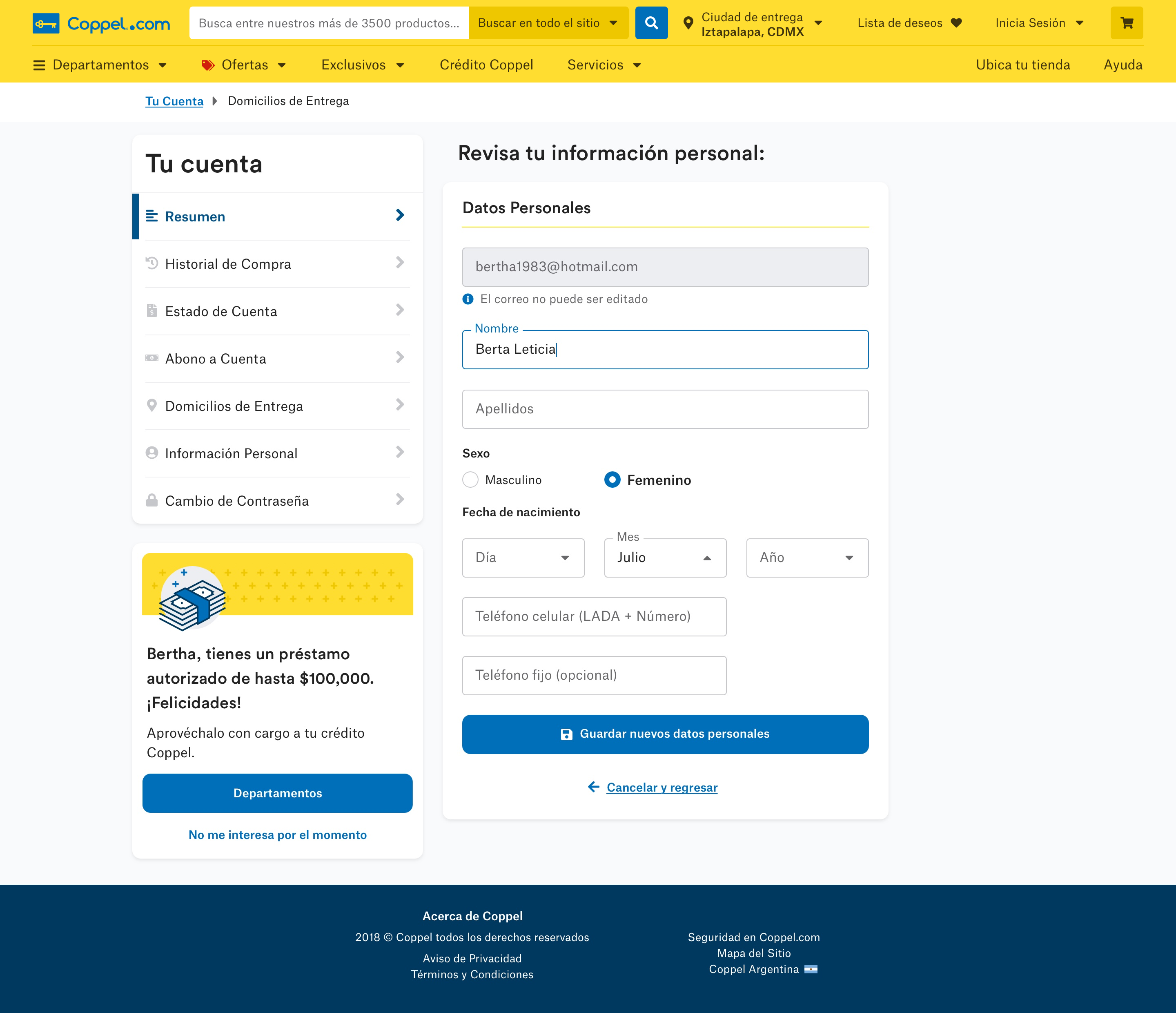
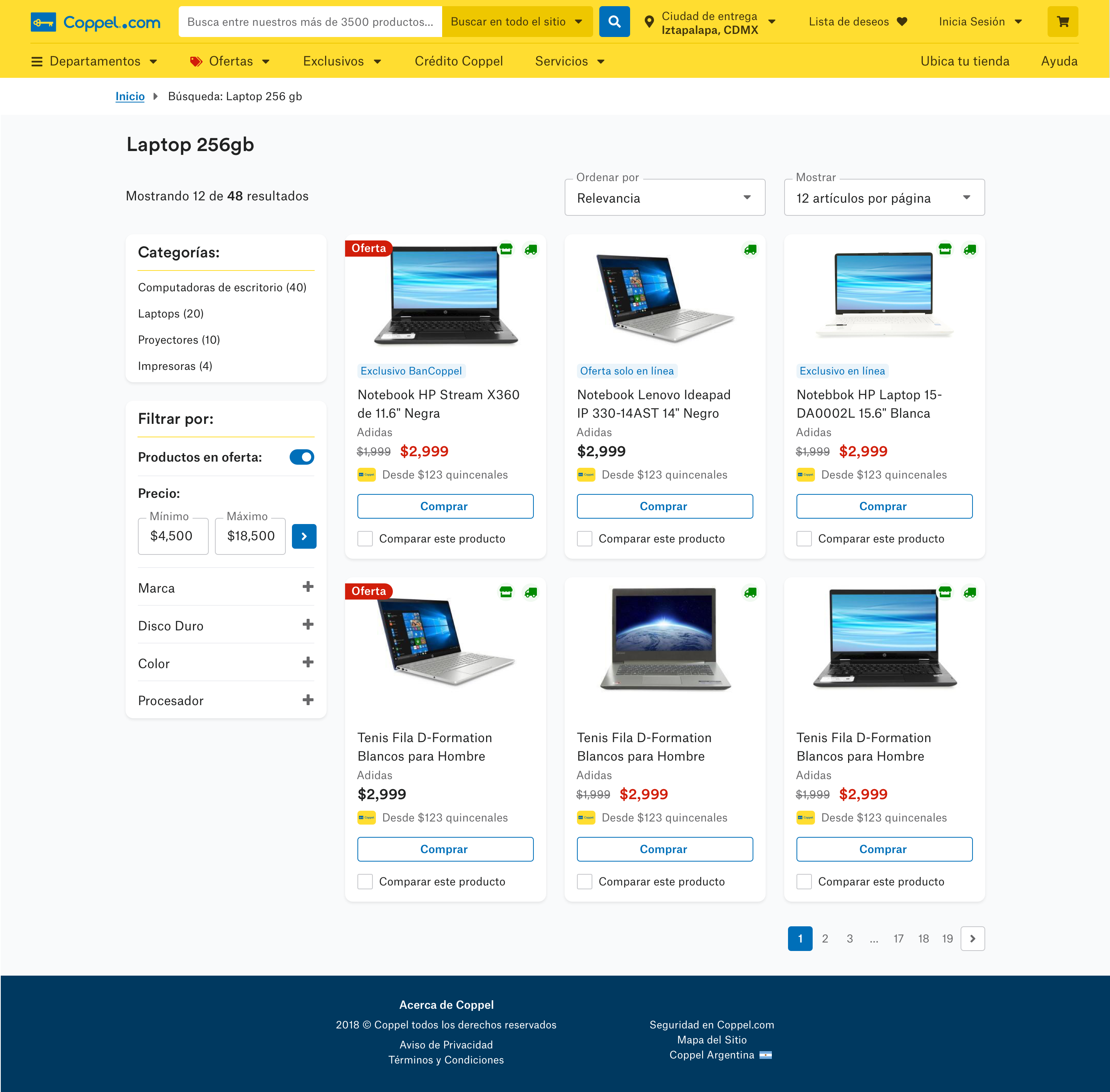
The Final Designs
Mobile First
We were working on an Agile environment so, in order to optimize time, all the processes above happened while the UX Designers were working on the wireframes. As soon as the wireframes were tested and validated, I started creating the first mockups proposals.
According to analytics, most of their users access the site on their phones, so we build with a mobile-first approach.
Desktop
After the mobile mockups were validated, I proceeded to design the desktop version. It followed similar design principles that the mobile one, but with its own properties (e.g., a 12 columns grid layout).
The Design System
The system was composed of two main deliverables: the detailed documentation of the design components and their properties, called Styleguide, and the system of live components in code. Likewise, the Styleguide was divided in two main sections: Foundations and Components.
Foundations
This section consisted of colors, typography styles, grid and icons that were used as building blocks for the design components.
Components
Once the foundations were stablished and the mockups were validated, I started documenting the UI elements or components into the style guide among its specs: use cases, do's and don'ts, sizing, hierarchy.
Atomic Designed
On a high level the atomic design methodology consists in breaking an interface down into its basic components, and then reuse them throughout the site. In this example, all 3 buttons are using the same character style. And the colors they’re made of are also an atom that is reused in the text links as well.
Learnings
This project took place between November 2018 and May 2019 -and yes, time really does fly, especially in tech. Today, design systems have become a staple across teams, and tools like Figma have made the process much more streamlined.
With that in mind, it might not be worth diving into the old Sketch-InVision-Zeplin-Abstract setup I used to design and collaborate with the development team. But the research, soft skills, and lessons learned from that time still feel just as relevant.
If it's not documented, it doesn't exist.
I worked in this project during my time at Wizeline, a consultancy. This redesign and its system were made for the in-house team at Coppel to adopt it, use it and scale it, so we had to be sure that every design decision was documented, otherwise all the reasoning and effort behind those agreements could be lost in the hand-off.
Don't build for the sake of build.
I spent time creating a Pagination component (with all their states) only to later be informed by the dev team that the best solution was infinite scrolling. After that, I stablished a practical rule: only detail variants and document components that were already part of a validated screen. Yes, the order matters. Be sure to always involve business.
Be realistic.
At first, I proposed a licensed typeface ignoring that we were on a budget. Fortunately, I later found a free alternative that meet the requirements, but the lesson stays: consider the limitations of the project, whatever they are (budget, time, etc.) and get through it.
←
Back to Projects
COPYRIGHT © 2025 KARLA MARTINEZ.
These works have been distributed to you on a confidential basis for your information only. By accepting it, you agree not to disclose them to any other person or entity in any way or use the information for any purpose other than to consider business opportunities with Karla Martinez.